
Saturday, 8 February 2014
.jpg)
Tuesday, 4 February 2014
Monday, 20 January 2014
4) How did you use new media technologies in the construction and research, planning and evaluation stages?
The main source of technology that we used was the Internet but all technologies were vital in bringing our project together, whether it be editing components, means by research or even the way our group was able to connect an organised shooting schedules by text message. We used the Internet for our research and planning stages and helped us find the required information of:

 Such websites as YouTube and Wikipedia, as well as short film distributors like the Channel 4 website helped us to view many different kinds of short film. This was pivotal to our project as it we were able to view other Short films, gaining ideas and how we could structure our short film, with the main conventions of short films. Without this, their would be a limited platform by which people would be able to access short film and view them, with the only ways in which we would be able to find sample films would be by either film festivals or by promotional DVDs.

Moreover the Internet, being the vast medium that it is allowed us to research what comprises short films, as well as help us to find short films to watch and analyse for our own project. This was invaluable, as without the Internet, finding short films would have been an endearing task due to the limited distribution of short films, making what we had to do a thousand times simpler.

Furthermore like all phases of our project, 'Blogger' helped us to record everything that we had done, and was useful due to its user friendly nature and Synergy between this site and Phones, which help us to blog about our projects from our very phones but also allows for rich multimedia capable blogs, with video, pictures, as well as the ability to embed YouTube videos within the blog itself, which becomes very useful for these Blogs. These blogs allowed us to keep our project together due to its user friendly and allowed us to access previous blogs to add to research had we found something we didn't mention before
- What a short film is.
- Examples of specific short films.
- Examples of Movie posters and magazine review articles.
- The codes and conventions of all three.
Such websites as YouTube and Wikipedia, as well as short film distributors like the Channel 4 website helped us to view many different kinds of short film. This was pivotal to our project as it we were able to view other Short films, gaining ideas and how we could structure our short film, with the main conventions of short films. Without this, their would be a limited platform by which people would be able to access short film and view them, with the only ways in which we would be able to find sample films would be by either film festivals or by promotional DVDs. Moreover the Internet, being the vast medium that it is allowed us to research what comprises short films, as well as help us to find short films to watch and analyse for our own project. This was invaluable, as without the Internet, finding short films would have been an endearing task due to the limited distribution of short films, making what we had to do a thousand times simpler.
Furthermore like all phases of our project, 'Blogger' helped us to record everything that we had done, and was useful due to its user friendly nature and Synergy between this site and Phones, which help us to blog about our projects from our very phones but also allows for rich multimedia capable blogs, with video, pictures, as well as the ability to embed YouTube videos within the blog itself, which becomes very useful for these Blogs. These blogs allowed us to keep our project together due to its user friendly and allowed us to access previous blogs to add to research had we found something we didn't mention before
However, to consider the pivotal elements which drew our production stage together, one must also consider the factors that helped us get together in order to film. Telephones and such instant messaging websites such as Facebook, was essential in organising our shooting schedule to times that would suit everyone. One of the reasons this was vital, was that on the first day of shooting, gale force winds caused delays on public transport, and the technology of using these sites and devices meant that everyone could arrive safely and on time to the shooting location.


 These two images express how manual focus and auto focus work. The one on the left is one that would more than likely feature in films, as it lets the audience see what the director wants them to see. The one on the right is more unprofessional, as everything in the image is in focus, and the director has no power over what the audience should look at.
For the Movie Poster, the best camera we found to use was an iPhone camera, which managed to take high quality photos and was easy to transfer over to computer for use of Photoshop. These managed to take high quality pictures with high resolution, which mean that they could be blown to an A3 or A4 size, so as to look like a professional movie poster, without losing its detail and blurring up. What was useful, is that the photos would be easily transferable to photoshop due to being .jpeg files, which could be layered on top of other images and manipulated to, again, give that professional look that we desired.

Layering is evident on this poster, with the character in the foreground will have been taken separately to the images in the background.
Like at AS, the editing software that we used was iMovie 11 for the Apple Mac. This was an extremely useful user friendly tool which allowed us to add audio clips for voice overs and scores and cut clips and put them together in a non-linear fashion, which means that clips did not have to put in, in a chronological order. iMovie is a non-destructive form of editing, which allows editors to make a project, and if it turns out bad they can delete it, but still have the footage to try again which is useful for non-chronological short films like ours in which order constantly changes. To get audio for these Short films, the Internet was our ally again, with such royalty free sites as Freesfx.com allowing us to download scores which would be suitable for the films, but not cost anything and break the rules of the project criteria. At A2 level we had more expert knowledge and finesse when using iMovie however, allowing us to implement such cinema techniques as split screens, that we were not in need of at AS and could implement effectively at A2.
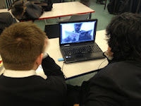
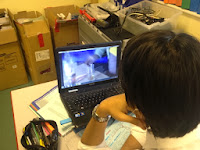
 This screen shot shows the capabilities of the iMovie software. This shows our progression in our use of the software and our progression in use of the technical aspect of shooting film sequences, being able to merge two shots into one, being able to parallel to sequences together, as we had done in the short film.
Pages and Photoshop for the magazine film review and movie poster, respectively, are both similar in that they both use the compiling of image and text in order to create a working product. Photoshop itself is more about Image manipulation and pages is more about desktop publishing, creating word documents, with image and is comprised of text boxes and columns to give the polished look of a real magazine article.
.jpg) One of the best ways in which we implemented the Internet was to distribute our short film in order to gain feedback from our audience, and make appropriate changes. For this we used sites such as Twitter and YouTube in order to spread our short film to our target audience with the easy upload features which can be instantly uploaded onto all Internet enabled devices.
One of the best ways in which we implemented the Internet was to distribute our short film in order to gain feedback from our audience, and make appropriate changes. For this we used sites such as Twitter and YouTube in order to spread our short film to our target audience with the easy upload features which can be instantly uploaded onto all Internet enabled devices.
 Photoshop itself was key for our movie poster, as it allowed us to layer images on top of each other, as well as manipulate images in terms of size and colour when splicing the images together. Photoshop also allows the user to insert text which can be manipulated in the same way, which was useful for the titles and Billing Block, allowing to give texture to the title, making it prominent, and creating the skinny font that is so common among Professional billing blocks. This was key for making our movie poster in which we were able to blend text and image together to create the professional movie poster effect.
Like at AS, the editing software that we used was iMovie 11 for the Apple Mac. This was an extremely useful user friendly tool which allowed us to add audio clips for voice overs and scores and cut clips and put them together in a non-linear fashion, which means that clips did not have to put in, in a chronological order. iMovie is a non-destructive form of editing, which allows editors to make a project, and if it turns out bad they can delete it, but still have the footage to try again which is useful for non-chronological short films like ours in which order constantly changes. To get audio for these Short films, the Internet was our ally again, with such royalty free sites as Freesfx.com allowing us to download scores which would be suitable for the films, but not cost anything and break the rules of the project criteria. At A2 level we had more expert knowledge and finesse when using iMovie however, allowing us to implement such cinema techniques as split screens, that we were not in need of at AS and could implement effectively at A2.
Photoshop itself was key for our movie poster, as it allowed us to layer images on top of each other, as well as manipulate images in terms of size and colour when splicing the images together. Photoshop also allows the user to insert text which can be manipulated in the same way, which was useful for the titles and Billing Block, allowing to give texture to the title, making it prominent, and creating the skinny font that is so common among Professional billing blocks. This was key for making our movie poster in which we were able to blend text and image together to create the professional movie poster effect.
Like with the short film, we used iMovie in order to create podcasts for our evaluation, as explained they are useful for stringing together image as well and moving image. But, however, this time rather than using large sections of footage to create a film, these podcasts were built upon Audio split from a clip, which would then be laid along side short clips from the film and images relating to what the evaluation question was talking about. Moreover, as evident within this blog post itself, these blogs were made using text, image, gifs and videos in a multimedia rich blog post. This shows the qualities of the site blogger and how pivotal it was in our project, with its multimedia capabilities being at the helm of it. One of the more creative abilities these multimedia rich blog posts enable us to do, is attach pictures, videos and Gifs (Moving Images) in order to make these blog posts look attractive.

What we feel had the biggest impact on our project was the website Blogger. for all other scenarios there was the possibility of using either a different software in the case of iMovie or even a camera when filming. Blogger is one of the few sites that can organise a project as well as promote what we have been doing in a professional and educational manner, showing how we formed our project in a step-by-step way. Without blogger we would have needed to create a portfolio which is not as editable in the way that blogger is, and is definitely less multimedia friendly.
Tuesday, 14 January 2014
3) What have you learnt from your audience feedback?

Audience feedback is the key aspect which can judge whether a film can be potentially successful or be a potential disaster. The audience are the reason why the media product is able to create revenue and lead to potential profits for without them, there would be no way for the company to create money. By asking audiences to watch the film and then comment on it or individual areas, you will be able to get an answer on what they think could be changed or altered such as the case of the score of a section of a film or a particular ending of the film which the audiences respond negatively to.

For short films, unlike mainstream films which have a wider audience which will therefore appeal to a large variety of people, short independent films will have a certain defined audience. For example, the film 'Fish Tank' whilst not being a short film it is an independent film. It's main target audience are those who enjoy watching social realist films and those who like possible unresolved endings; a common feature in short films. This clearly sets the audience different to that of the mainstream audience who would prefer something more action orientated such as 'Iron Man' which has a clear ending.
Conducting our own research for short films, due to the audience being specifically set for those in education therefore, limiting the number of people who might want to see the film unlike those of a mainstream film. As we have audience feedback for the short film which was done online, and in person we could clearly see that the reason people wanted to see it was because they were in similar situations in terms of exams. By asking the correct appropriate age range we were able to get the responses that we needed. Whereas, if we were to ask the wrong audience such as children or elderly adults they might not have an interest in the film. Therefore, there is a clear difference between the differing audiences which we have been able to find. Through the synergy that media companies have, with our short film and the film poster we have also added this link with each other where the poster could not be produced if there was no synergy between the short film and poster.
By researching the audience profile for mainstream films on the http://business.pearlanddean.com/audience_profile we were able to see that as time has changed so has the differing styles of audience. This is relevant to our groups short film where without the research we might have targeted our film at the wrong type of audience. The sole reason why we decided to go for our film taking an educational role aimed at 15-24 year olds is because the website proves that they are the biggest market for going to the cinema compared to the audience range of 25-34 where they are only 19% of the audience who go to the cinema. Also in terms of demographic audiences again due to the research and the results showing that the large majority of audiences that go to the cinema are ABC1 which spans from upper middle class all the way to lower middle class. Although our film could have been targeted at C2 and D audiences we decided against this as they are not our key focus and we believed that the audiences we have chosen fit more into the educational moral story we have told. Linking to short films it could be said that unlike Hollywood films our demographic profile is actually C1 as those audiences might be able to relate closer to this whilst those higher up might potentially be focused on their work.
As stated previously, audience feedback is the key importance which can potentially influence a films production.
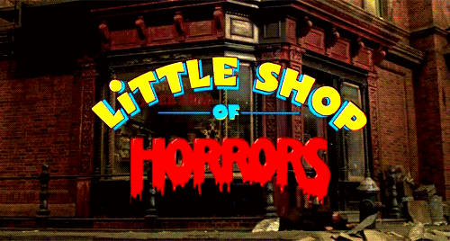 An example of where test audiences are crucial in the film process is in the 1986 film “Little Shop of Horrors”. The original ending involved all of the main characters dying sticking closely to that of the Broadway version. However, due to test audiences responding negatively to it after being attached to the two main characters, the ending was re-shot and what was produced and released in cinemas was a happier ending where the two survive and defeat the plant. Without the change at the end of the film due to audience feedback the film might not have done as well as it did.
Original Ending
Theatrical Ending
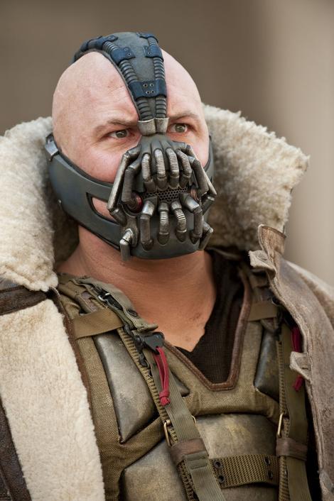 Another example which shows how important audience feedback is for the creation of media products is The Dark Night Rises. In the original pre-release Bane's voice could not be heard properly. However, Christopher Nolan did not want to re-shoot it due to time issues, so instead edited the voice slightly to be able to hear it more. Therefore, the audience feedback of Bane's voice was essential as without it, with a theatrical release people might have complained about it.
Bane's Voice before and after the editing.
 All this clearly shows just how important audience feedback truly is where without it, such as the case of “Charlie’s Angels: Full Throttle” which was reviewed terribly because of no audience feedback. the film will not perform as well. This caused the actresses that were in that film to be nominated for worst performances and the golden raspberry awards.
 When creating our media product we used audience feedback in conjunction with the creation of the media product in order to find out how the audience would respond to each of our areas of our products (film, poster and magazine). We used Facebook, YouTube, group and individual screenings and questionnaires about the media product in order to get the answers . We felt that it was the best way to get our responses as it is what people our age usually use/do and it is the easiest way to get information.

 In terms of our groups short film due to the audience age range of older teenagers and so those involved in exams we asked those in the age range of 17-19 due to having that age range in our school therefore making it easy to contact. For our short film we conducted various individual screenings where people would comment on our film and leave feedback on it. Some of the examples are shown below:

These are some of the comments that we have received when we uploaded our short film to FaceBook in order to receive comments on it. We believed that this way was an efficient way to get the reviews for our film due to most people our age using this social network site.


 From these, for our short film it was clear to see that there were positive aspects to the short film with most of the praise being around how the editing was and the whole humour side which we wanted. Conversely, the most common complaint was the sound and the possible extra scene. By taking these at hand and then viewing the clip again we found errors in the sound. The error that we discovered was that the score quickly increased in volume at a certain point and it was obvious that we had tried to make the sound loop but had unintentionally increased the sound as well. However, due to the audience feedback this issue was rectified. What we have learnt from the criticism was that the short film was shorter than most audiences would have liked, and that there are some minor issues with audio to be taken into account on our next edit. However, we feel that the short film is the optimum length, as to extend the film any further would have hindered the effectiveness of the film for the message it was trying to give
In order to obtain some criticism and to find out what people liked about our poster, we showed it to a group of people. Some of this may be helpful in order to know what to change to entice a wider audience for our film.
• Anastasios Kaimakamis, 17 - "Good use of images in the way they're positioned, the way they're looking at each other is really good. I think the Tagline is too long though and takes up too much space, either shorten it or change its position."

• James Bucu, 17 - "It’s very simplistic and I think it works well like that. All the information is there to be seen and I can tell all I need to know, to watch this film and is all positioned right. Try to spruce it up a bit with more colour."
From the individual comments that we received for the poster we could see that the audiences were positive on how the poster was laid out and how the images were relevant and made sense which is what we were intending as Anastasios stated. However, a complaint that was brought up by some people is the lack of colour for the poster. We however, did not decide to change that due to our group going for a more simplistic nature which has been said to work so well by other people. The simplistic nature of the white works well with the feeling of the character Mark as a ghost where by changing this we might not be able to get the same affect that we wanted across.
The colour of the poster is of key importance where if the colour was not white then there would possibly be no connotations of the 'ghost' that we intended on. For example, if the colour was light red, then there might be different connotations to what the film is about such as possibly being about danger, or perhaps blood. As this is not the direction we were going then it is clear to see why the white colour for our poster works so well.
For the magazine article review which complements the short film this time we handed out individual sheets to some people where they would write down what they thought about the magazine review and what could possibly be improved. The comments were largely positive with some minor changes being made such as the removal of the shadow which made it difficult to read. Below are some of the comments that the audiences made when viewing the magazine:
Jesse Cherdchuwichaikoon - 18 Years Old
.jpg)
Ogor Osubor - 17 Years Old
.jpg)

Above is the magazine article which features the before and after when receiving audience feedback on the magazine.
The breakout box colour as shown above was changed after receiving audience feedback on the article with the majority of complaints being from there. Additionally, changes in the font of 'A Student's Future' and the shadow used is also different.
Therefore, by looking at audience feedback we can clearly see that it plays a key part in part of our media products for without it, we would have had mistakes which if it was to be released in a film festival people might comment on and respond negatively to it which is not what we want to happen. So, potentially the audience feedback is the significant aspect which if we didn't use effectively might have made our media products be a disaster.
Monday, 13 January 2014
Sunday, 12 January 2014
Thursday, 19 December 2013
Second edit
Some of the changes made in this edit that we felt we needed to rectify were:
- The credits Featured the wrong name for the head of year character.
- fixes to the split-screen as some places lacked accuracy.
- adding voiceover to cafe scene.
- changes to the score.
Thursday, 12 December 2013
Comments on movie poster
In order to obtain some criticism and to find out what people liked about our poster, we showed it to a group of people. Some of this may be helpful in order to know what to change to entice a wider audience for our film. What was important was to show it to people who hadn't seen our film yet in order for them to take knowledge away from the poster about what the film could possibly be about. The comments we obtained are as follows:
Oliver Round, 18
"I like that you used contrasting pictures of Daniel in different clothes to show that it was two different versions of himself. It was slightly lacking colour though, and what would make it better would be to make it more vibrant."
Anastasios Kaimakamis, 17
"Good use of images in the way they're positioned, the way they're looking at each other is really good. I think the Tagline is too long though and takes up too much space, either shorten it or change its position."
Aydin Aydinc, 17
"The layout is really good everything is positioned where it should be and looks professional, but its a bit bland. a few more images or added colour might make it more attractive."
James Bucu, 17
"Its very simplistic and I think it works well like that. All the information is there to be seen and I can tell all I need to know, to watch this film and is all positioned right. Try to spruce it up a bit with more colour."
What we have learnt from these comments is that the audience find the lack of colour in the poster make it less vibrant for them and that the introduction of colour in some places might help to make the poster more attractive. This will be difficult to accomplish due to the simplistic nature of our poster, which has been said to work well, and so trial and error of changing the colour scheme of the poster may be implemented to see if it works well.
What we have learnt from these comments is that the audience find the lack of colour in the poster make it less vibrant for them and that the introduction of colour in some places might help to make the poster more attractive. This will be difficult to accomplish due to the simplistic nature of our poster, which has been said to work well, and so trial and error of changing the colour scheme of the poster may be implemented to see if it works well.
Wednesday, 11 December 2013
Second Version of Magazine Article
.jpg)

Before and After
In terms of the layout where one of the comments stated that it was quite confusing, as only one person stated it compared to everyone else who commented that the layout was simple and easy to read the layout would therefore not need to be changed. If it needed to be changed after getting the audience's feedback there would be a chance that it might not be possible due to the issue of having little time left. However, if more people were concerned about the issue and there was more time where a re-edit would be possible, then a change to the magazine layout would be considered.
Tuesday, 10 December 2013
Short film second edit
Some of the changes made in this edit that we felt we needed to rectify were:
- The credits Featured the wrong name for the head of year character.
- Adding on a heart beat to the production title to make it more prominent.
- fixes to the split-screen as some places lacked accuracy.
- adding voiceover to cafe scene.
- changes to the score.
Criticism for Short film
After creating an edit that was ready for public evaluation, we showed people the short film in order to find out what they thought the positives and negatives of the clip, as well as what could be changed to the negatives to make the film better, from their opinion. The people whom we asked their opinion where between the ages of 17 and 19, all of which are in the barrier of our target audience, and so their opinion as to wether the short film had an effect on them would be important for us and showed wether we achieved what we had set out to do.
Dominic Byrne, 17
"What was good was the consistent themes and performance. it was well executed and looked professional."
"However, the plot was slightly Generic and the locations were dull, adding an extra scene with a different location would make it more interesting"
Charlie Hermans, 18
 "It was very well edited with the split-screen, but the audio was inconsistent, you should extend it and modify the audio levels"
Joe Power, 17
"The short film was well edited and I like the how the split-screen works, but the music was annoying, either quieten it or change it."
Joshua Asto, 17
"The different perspectives of the characters live made it very interesting to watch and the humour was executed greatly. I would have liked if the story had another scene to show what else happened in his life, and i think another scene would make the film easier to understand"
What we have learnt from the criticism was that the short film was shorter than most audiences would have liked, and that there are some minor issues with audio to be taken into account on our next edit. However, we feel that the short film is the optimum length, as to extend the film any further would have hindered the effectiveness of the film for the message it was trying to give, although, the scene when the ghost appears could have been changed to inform the audience that he is in fact a ghost of his future rather than just him, as that was the main issue that people had comprehending. This also can be mended with either another scene at the start of "The Ghosts" appearance, or by a witty comeback in a voiceover in which Marks character is talking to the ghost. Both will be taken into consideration.

This Comment in feedback was useful for us as it had been seen by a viewer that we had credited the wrong person in the credits, which could have been quite humiliating had we not amended this. Moreover, having previously been a Media Student, Regan was able to understand forms and conventions as well, as the way cinematography works, which gave us an advantage as he was part of our target audience, but also has an understanding of media studies giving us a well understood evaluation of our film.
This also was a usefully example of audience feedback. This viewer had pointed out that the credit titles used were not as professional as say a feature length film. This gave us the idea to go back and change this, to give a black background with white writing upon it, giving that more professional look.


Dominic Byrne, 17
"What was good was the consistent themes and performance. it was well executed and looked professional."
"However, the plot was slightly Generic and the locations were dull, adding an extra scene with a different location would make it more interesting"
Charlie Hermans, 18
 "It was very well edited with the split-screen, but the audio was inconsistent, you should extend it and modify the audio levels"
Joe Power, 17
"The short film was well edited and I like the how the split-screen works, but the music was annoying, either quieten it or change it."


Joshua Asto, 17
"The different perspectives of the characters live made it very interesting to watch and the humour was executed greatly. I would have liked if the story had another scene to show what else happened in his life, and i think another scene would make the film easier to understand"
What we have learnt from the criticism was that the short film was shorter than most audiences would have liked, and that there are some minor issues with audio to be taken into account on our next edit. However, we feel that the short film is the optimum length, as to extend the film any further would have hindered the effectiveness of the film for the message it was trying to give, although, the scene when the ghost appears could have been changed to inform the audience that he is in fact a ghost of his future rather than just him, as that was the main issue that people had comprehending. This also can be mended with either another scene at the start of "The Ghosts" appearance, or by a witty comeback in a voiceover in which Marks character is talking to the ghost. Both will be taken into consideration.

This Comment in feedback was useful for us as it had been seen by a viewer that we had credited the wrong person in the credits, which could have been quite humiliating had we not amended this. Moreover, having previously been a Media Student, Regan was able to understand forms and conventions as well, as the way cinematography works, which gave us an advantage as he was part of our target audience, but also has an understanding of media studies giving us a well understood evaluation of our film.

This also was a usefully example of audience feedback. This viewer had pointed out that the credit titles used were not as professional as say a feature length film. This gave us the idea to go back and change this, to give a black background with white writing upon it, giving that more professional look.
Comments on Magazine Article
After finishing creating the magazine review we distributed it to the audience range that we were aimed at (film guru's and older teenagers) and got them to comment on the magazine review. Overall, the comments were largely positive but there were some criticisms that were present which will be changed where relevant and necessary.
 "The newspaper article works really well. The picture grabs the readers attention because of his facial expression which makes it more likely for audiences to read it. There are a few grammatical errors in the text and one word not making sense. Also the text is a little hard to read because of the background image"
.jpg)
.jpg)
From the comments that we have received form the magazine article it is clear that the most common praises are the actual text of the review which people are commenting on stating that it is fit for the audience we were looking for, and the layout of the magazine and the image used which a lot of the audience have said that is the key element that drew them in to read the article.
However, we also received some criticism from the magazine review which will be changed to rectify the issues. The most common complaint was the breakout boxes on the right of the article where most audiences suggested that it looked a little weird and would be best if it changed colour, due to this coming up in almost all of the comments this is going to be the key thing that will be changed.
Another issue from one user which was mentioned was the over use of the shadow for the heading which will also be changed due to it appearing too dark on the page.
Ogor Osubor - 17 Years Old
"The newspaper article works really well. The picture grabs the readers attention because of his facial expression which makes it more likely for audiences to read it. There are a few grammatical errors in the text and one word not making sense. Also the text is a little hard to read because of the background image"
Jesse Cherdchuwichaikoon - 18 Years Old
Laura Hanley - 18 Years Old
.jpg)
Joshua Asto - 17 Years Old
"The magazine review is very informative and gives relevant information that is relevant to the audience. The image at the top left of the page is eye catching and that is one of the things that has attracted me to read the magazine. The text is very informative and contains the relevant information. The only thing I would question is the boxes on the right. Maybe the colour could be different"
However, we also received some criticism from the magazine review which will be changed to rectify the issues. The most common complaint was the breakout boxes on the right of the article where most audiences suggested that it looked a little weird and would be best if it changed colour, due to this coming up in almost all of the comments this is going to be the key thing that will be changed.
Another issue from one user which was mentioned was the over use of the shadow for the heading which will also be changed due to it appearing too dark on the page.
Subscribe to:
Comments (Atom)