.jpg)
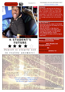
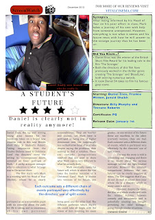
Before and After
This is the second version of our magazine article which includes the changes made that the audience made a comment on before. The breakout box colour on the right was changed due to the audience feedback previously being negative towards it. In this case, the new colour received positive reviews and was largely praised when compared to that of the previous colour. Minor changes have been for the heading 'A Student's Future' matching the font of the sub-heading due to some comments stating that it looked weird to have so many fonts on one page. The use of no shadow on the heading 'A Student's Future was also removed which makes it easier to read and makes it have a professional look to it. All of the relevant changes that were made were all due to the audiences comments that we received after letting them critically view the magazine.
In terms of the layout where one of the comments stated that it was quite confusing, as only one person stated it compared to everyone else who commented that the layout was simple and easy to read the layout would therefore not need to be changed. If it needed to be changed after getting the audience's feedback there would be a chance that it might not be possible due to the issue of having little time left. However, if more people were concerned about the issue and there was more time where a re-edit would be possible, then a change to the magazine layout would be considered.
.jpg)

No comments:
Post a Comment