- The credits Featured the wrong name for the head of year character.
- fixes to the split-screen as some places lacked accuracy.
- adding voiceover to cafe scene.
- changes to the score.
Thursday, 19 December 2013
Second edit
Some of the changes made in this edit that we felt we needed to rectify were:
Thursday, 12 December 2013
Comments on movie poster
In order to obtain some criticism and to find out what people liked about our poster, we showed it to a group of people. Some of this may be helpful in order to know what to change to entice a wider audience for our film. What was important was to show it to people who hadn't seen our film yet in order for them to take knowledge away from the poster about what the film could possibly be about. The comments we obtained are as follows:
Oliver Round, 18
"I like that you used contrasting pictures of Daniel in different clothes to show that it was two different versions of himself. It was slightly lacking colour though, and what would make it better would be to make it more vibrant."
Anastasios Kaimakamis, 17
"Good use of images in the way they're positioned, the way they're looking at each other is really good. I think the Tagline is too long though and takes up too much space, either shorten it or change its position."
Aydin Aydinc, 17
"The layout is really good everything is positioned where it should be and looks professional, but its a bit bland. a few more images or added colour might make it more attractive."
James Bucu, 17
"Its very simplistic and I think it works well like that. All the information is there to be seen and I can tell all I need to know, to watch this film and is all positioned right. Try to spruce it up a bit with more colour."
What we have learnt from these comments is that the audience find the lack of colour in the poster make it less vibrant for them and that the introduction of colour in some places might help to make the poster more attractive. This will be difficult to accomplish due to the simplistic nature of our poster, which has been said to work well, and so trial and error of changing the colour scheme of the poster may be implemented to see if it works well.
What we have learnt from these comments is that the audience find the lack of colour in the poster make it less vibrant for them and that the introduction of colour in some places might help to make the poster more attractive. This will be difficult to accomplish due to the simplistic nature of our poster, which has been said to work well, and so trial and error of changing the colour scheme of the poster may be implemented to see if it works well.
Wednesday, 11 December 2013
Second Version of Magazine Article
.jpg)

Before and After
In terms of the layout where one of the comments stated that it was quite confusing, as only one person stated it compared to everyone else who commented that the layout was simple and easy to read the layout would therefore not need to be changed. If it needed to be changed after getting the audience's feedback there would be a chance that it might not be possible due to the issue of having little time left. However, if more people were concerned about the issue and there was more time where a re-edit would be possible, then a change to the magazine layout would be considered.
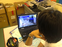
Tuesday, 10 December 2013
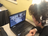
Short film second edit
Some of the changes made in this edit that we felt we needed to rectify were:
- The credits Featured the wrong name for the head of year character.
- Adding on a heart beat to the production title to make it more prominent.
- fixes to the split-screen as some places lacked accuracy.
- adding voiceover to cafe scene.
- changes to the score.
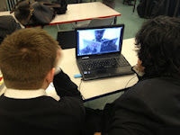
Criticism for Short film
After creating an edit that was ready for public evaluation, we showed people the short film in order to find out what they thought the positives and negatives of the clip, as well as what could be changed to the negatives to make the film better, from their opinion. The people whom we asked their opinion where between the ages of 17 and 19, all of which are in the barrier of our target audience, and so their opinion as to wether the short film had an effect on them would be important for us and showed wether we achieved what we had set out to do.
Dominic Byrne, 17
"What was good was the consistent themes and performance. it was well executed and looked professional."
"However, the plot was slightly Generic and the locations were dull, adding an extra scene with a different location would make it more interesting"
Charlie Hermans, 18
 "It was very well edited with the split-screen, but the audio was inconsistent, you should extend it and modify the audio levels"
Joe Power, 17
"The short film was well edited and I like the how the split-screen works, but the music was annoying, either quieten it or change it."
Joshua Asto, 17
"The different perspectives of the characters live made it very interesting to watch and the humour was executed greatly. I would have liked if the story had another scene to show what else happened in his life, and i think another scene would make the film easier to understand"
What we have learnt from the criticism was that the short film was shorter than most audiences would have liked, and that there are some minor issues with audio to be taken into account on our next edit. However, we feel that the short film is the optimum length, as to extend the film any further would have hindered the effectiveness of the film for the message it was trying to give, although, the scene when the ghost appears could have been changed to inform the audience that he is in fact a ghost of his future rather than just him, as that was the main issue that people had comprehending. This also can be mended with either another scene at the start of "The Ghosts" appearance, or by a witty comeback in a voiceover in which Marks character is talking to the ghost. Both will be taken into consideration.

This Comment in feedback was useful for us as it had been seen by a viewer that we had credited the wrong person in the credits, which could have been quite humiliating had we not amended this. Moreover, having previously been a Media Student, Regan was able to understand forms and conventions as well, as the way cinematography works, which gave us an advantage as he was part of our target audience, but also has an understanding of media studies giving us a well understood evaluation of our film.
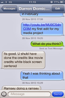
This also was a usefully example of audience feedback. This viewer had pointed out that the credit titles used were not as professional as say a feature length film. This gave us the idea to go back and change this, to give a black background with white writing upon it, giving that more professional look.


Dominic Byrne, 17
"What was good was the consistent themes and performance. it was well executed and looked professional."
"However, the plot was slightly Generic and the locations were dull, adding an extra scene with a different location would make it more interesting"
Charlie Hermans, 18
 "It was very well edited with the split-screen, but the audio was inconsistent, you should extend it and modify the audio levels"
Joe Power, 17
"The short film was well edited and I like the how the split-screen works, but the music was annoying, either quieten it or change it."


Joshua Asto, 17
"The different perspectives of the characters live made it very interesting to watch and the humour was executed greatly. I would have liked if the story had another scene to show what else happened in his life, and i think another scene would make the film easier to understand"
What we have learnt from the criticism was that the short film was shorter than most audiences would have liked, and that there are some minor issues with audio to be taken into account on our next edit. However, we feel that the short film is the optimum length, as to extend the film any further would have hindered the effectiveness of the film for the message it was trying to give, although, the scene when the ghost appears could have been changed to inform the audience that he is in fact a ghost of his future rather than just him, as that was the main issue that people had comprehending. This also can be mended with either another scene at the start of "The Ghosts" appearance, or by a witty comeback in a voiceover in which Marks character is talking to the ghost. Both will be taken into consideration.

This Comment in feedback was useful for us as it had been seen by a viewer that we had credited the wrong person in the credits, which could have been quite humiliating had we not amended this. Moreover, having previously been a Media Student, Regan was able to understand forms and conventions as well, as the way cinematography works, which gave us an advantage as he was part of our target audience, but also has an understanding of media studies giving us a well understood evaluation of our film.

This also was a usefully example of audience feedback. This viewer had pointed out that the credit titles used were not as professional as say a feature length film. This gave us the idea to go back and change this, to give a black background with white writing upon it, giving that more professional look.
Comments on Magazine Article
After finishing creating the magazine review we distributed it to the audience range that we were aimed at (film guru's and older teenagers) and got them to comment on the magazine review. Overall, the comments were largely positive but there were some criticisms that were present which will be changed where relevant and necessary.
 "The newspaper article works really well. The picture grabs the readers attention because of his facial expression which makes it more likely for audiences to read it. There are a few grammatical errors in the text and one word not making sense. Also the text is a little hard to read because of the background image"
.jpg)
.jpg)
From the comments that we have received form the magazine article it is clear that the most common praises are the actual text of the review which people are commenting on stating that it is fit for the audience we were looking for, and the layout of the magazine and the image used which a lot of the audience have said that is the key element that drew them in to read the article.
However, we also received some criticism from the magazine review which will be changed to rectify the issues. The most common complaint was the breakout boxes on the right of the article where most audiences suggested that it looked a little weird and would be best if it changed colour, due to this coming up in almost all of the comments this is going to be the key thing that will be changed.
Another issue from one user which was mentioned was the over use of the shadow for the heading which will also be changed due to it appearing too dark on the page.
Ogor Osubor - 17 Years Old
"The newspaper article works really well. The picture grabs the readers attention because of his facial expression which makes it more likely for audiences to read it. There are a few grammatical errors in the text and one word not making sense. Also the text is a little hard to read because of the background image"
Jesse Cherdchuwichaikoon - 18 Years Old
.jpg)
Laura Hanley - 18 Years Old
.jpg)
Joshua Asto - 17 Years Old
"The magazine review is very informative and gives relevant information that is relevant to the audience. The image at the top left of the page is eye catching and that is one of the things that has attracted me to read the magazine. The text is very informative and contains the relevant information. The only thing I would question is the boxes on the right. Maybe the colour could be different"
However, we also received some criticism from the magazine review which will be changed to rectify the issues. The most common complaint was the breakout boxes on the right of the article where most audiences suggested that it looked a little weird and would be best if it changed colour, due to this coming up in almost all of the comments this is going to be the key thing that will be changed.
Another issue from one user which was mentioned was the over use of the shadow for the heading which will also be changed due to it appearing too dark on the page.
Thursday, 5 December 2013
Finalised Movie Poster


Magazine Article

This is the finalised version for our groups magazine article. We feel that it is able to match our representative age group that being older teenagers and those who love films, due to the simple layout of our design and the actual review of the film which is both chatty yet still informative in what it tries to do. There have been some changes from the original magazine layout that was initially designed by our group. One of these relates to the columns that are involved and the actual placement of the breakout boxes. Compared to the initial magazine layout where it was complicated to read and quite complicated by putting all of the columns onto the bottom half of the page it makes the audience able to read it clearer than compared to where it was originally going to be placed. Finally, there are also some areas such as graphics where by looking closely at more magazine reviews we found that where we placed the film rating was random. Thus, it is why in the final product we placed it below the film title 'A Student's Future'. Which was also changed after we realised that it would work better if it was called that.
Changes to the script
Due to the length of the film being to short, and what we felt was a dragged out opening sequence, we added two more scenes to the start of the film and the end, both done in the format of a confessional video in which Mark is talking to the camera. At first it was only to take place at the beginning but we felt could be useful for our after credits scene.
Script for the opening of the film:
INT. CLASSROOM. DAY.
MARK is in a classroom doing a confession to the camera.
The scene for after the Credits:
INT. CLASSROOM. DAY.
MARK is talking to the camera, reviewing his experience with the GHOST.
Script for the opening of the film:
INT. CLASSROOM. DAY.
MARK is in a classroom doing a confession to the camera.
MARK
Hi, my names mark. I'm, you know, that guy. Always in trouble
even when I haven't done anything
(Voice Over)
Take today for example, just got called into the head of years office.
He says "Mark you haven't been working hard enough in Sociology"
and I tell him I have been working on my relations between men and women.
And he gives me that "what you talking 'bout willis?" look as if i had done something wrong.
He then moves onto Chemistry, I'm "not revising experiments" apparently.
Well... close enough.
Finally he gives me gip about my ICT coursework, yeah i like to take a break or two,
but I've always got my head in the game.
I honestly do not know what he's talking about most of the time, and i know i'm top of the class anyway. I'll be fine.
The scene for after the Credits:
INT. CLASSROOM. DAY.
MARK is talking to the camera, reviewing his experience with the GHOST.
MARK
Well it was the first time I taught myself a lesson.
(Voiceover)
I've started to work a lot harder and you could say that my future self
had quite an effect on me
but as to wether he cited a permanent effect in me...
Well... you decide.
Subscribe to:
Comments (Atom)