- The credits Featured the wrong name for the head of year character.
- fixes to the split-screen as some places lacked accuracy.
- adding voiceover to cafe scene.
- changes to the score.
Thursday, 19 December 2013
Second edit
Some of the changes made in this edit that we felt we needed to rectify were:
Thursday, 12 December 2013
Comments on movie poster
In order to obtain some criticism and to find out what people liked about our poster, we showed it to a group of people. Some of this may be helpful in order to know what to change to entice a wider audience for our film. What was important was to show it to people who hadn't seen our film yet in order for them to take knowledge away from the poster about what the film could possibly be about. The comments we obtained are as follows:
Oliver Round, 18
"I like that you used contrasting pictures of Daniel in different clothes to show that it was two different versions of himself. It was slightly lacking colour though, and what would make it better would be to make it more vibrant."
Anastasios Kaimakamis, 17
"Good use of images in the way they're positioned, the way they're looking at each other is really good. I think the Tagline is too long though and takes up too much space, either shorten it or change its position."
Aydin Aydinc, 17
"The layout is really good everything is positioned where it should be and looks professional, but its a bit bland. a few more images or added colour might make it more attractive."
James Bucu, 17
"Its very simplistic and I think it works well like that. All the information is there to be seen and I can tell all I need to know, to watch this film and is all positioned right. Try to spruce it up a bit with more colour."
What we have learnt from these comments is that the audience find the lack of colour in the poster make it less vibrant for them and that the introduction of colour in some places might help to make the poster more attractive. This will be difficult to accomplish due to the simplistic nature of our poster, which has been said to work well, and so trial and error of changing the colour scheme of the poster may be implemented to see if it works well.
What we have learnt from these comments is that the audience find the lack of colour in the poster make it less vibrant for them and that the introduction of colour in some places might help to make the poster more attractive. This will be difficult to accomplish due to the simplistic nature of our poster, which has been said to work well, and so trial and error of changing the colour scheme of the poster may be implemented to see if it works well.
Wednesday, 11 December 2013
Second Version of Magazine Article
.jpg)

Before and After
In terms of the layout where one of the comments stated that it was quite confusing, as only one person stated it compared to everyone else who commented that the layout was simple and easy to read the layout would therefore not need to be changed. If it needed to be changed after getting the audience's feedback there would be a chance that it might not be possible due to the issue of having little time left. However, if more people were concerned about the issue and there was more time where a re-edit would be possible, then a change to the magazine layout would be considered.
Tuesday, 10 December 2013
Short film second edit
Some of the changes made in this edit that we felt we needed to rectify were:
- The credits Featured the wrong name for the head of year character.
- Adding on a heart beat to the production title to make it more prominent.
- fixes to the split-screen as some places lacked accuracy.
- adding voiceover to cafe scene.
- changes to the score.
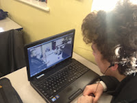
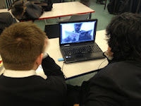
Criticism for Short film
After creating an edit that was ready for public evaluation, we showed people the short film in order to find out what they thought the positives and negatives of the clip, as well as what could be changed to the negatives to make the film better, from their opinion. The people whom we asked their opinion where between the ages of 17 and 19, all of which are in the barrier of our target audience, and so their opinion as to wether the short film had an effect on them would be important for us and showed wether we achieved what we had set out to do.
Dominic Byrne, 17
"What was good was the consistent themes and performance. it was well executed and looked professional."
"However, the plot was slightly Generic and the locations were dull, adding an extra scene with a different location would make it more interesting"
Charlie Hermans, 18
 "It was very well edited with the split-screen, but the audio was inconsistent, you should extend it and modify the audio levels"
Joe Power, 17
"The short film was well edited and I like the how the split-screen works, but the music was annoying, either quieten it or change it."
Joshua Asto, 17
"The different perspectives of the characters live made it very interesting to watch and the humour was executed greatly. I would have liked if the story had another scene to show what else happened in his life, and i think another scene would make the film easier to understand"
What we have learnt from the criticism was that the short film was shorter than most audiences would have liked, and that there are some minor issues with audio to be taken into account on our next edit. However, we feel that the short film is the optimum length, as to extend the film any further would have hindered the effectiveness of the film for the message it was trying to give, although, the scene when the ghost appears could have been changed to inform the audience that he is in fact a ghost of his future rather than just him, as that was the main issue that people had comprehending. This also can be mended with either another scene at the start of "The Ghosts" appearance, or by a witty comeback in a voiceover in which Marks character is talking to the ghost. Both will be taken into consideration.

This Comment in feedback was useful for us as it had been seen by a viewer that we had credited the wrong person in the credits, which could have been quite humiliating had we not amended this. Moreover, having previously been a Media Student, Regan was able to understand forms and conventions as well, as the way cinematography works, which gave us an advantage as he was part of our target audience, but also has an understanding of media studies giving us a well understood evaluation of our film.
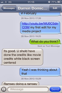
This also was a usefully example of audience feedback. This viewer had pointed out that the credit titles used were not as professional as say a feature length film. This gave us the idea to go back and change this, to give a black background with white writing upon it, giving that more professional look.


Dominic Byrne, 17
"What was good was the consistent themes and performance. it was well executed and looked professional."
"However, the plot was slightly Generic and the locations were dull, adding an extra scene with a different location would make it more interesting"
Charlie Hermans, 18
 "It was very well edited with the split-screen, but the audio was inconsistent, you should extend it and modify the audio levels"
Joe Power, 17
"The short film was well edited and I like the how the split-screen works, but the music was annoying, either quieten it or change it."


Joshua Asto, 17
"The different perspectives of the characters live made it very interesting to watch and the humour was executed greatly. I would have liked if the story had another scene to show what else happened in his life, and i think another scene would make the film easier to understand"
What we have learnt from the criticism was that the short film was shorter than most audiences would have liked, and that there are some minor issues with audio to be taken into account on our next edit. However, we feel that the short film is the optimum length, as to extend the film any further would have hindered the effectiveness of the film for the message it was trying to give, although, the scene when the ghost appears could have been changed to inform the audience that he is in fact a ghost of his future rather than just him, as that was the main issue that people had comprehending. This also can be mended with either another scene at the start of "The Ghosts" appearance, or by a witty comeback in a voiceover in which Marks character is talking to the ghost. Both will be taken into consideration.

This Comment in feedback was useful for us as it had been seen by a viewer that we had credited the wrong person in the credits, which could have been quite humiliating had we not amended this. Moreover, having previously been a Media Student, Regan was able to understand forms and conventions as well, as the way cinematography works, which gave us an advantage as he was part of our target audience, but also has an understanding of media studies giving us a well understood evaluation of our film.

This also was a usefully example of audience feedback. This viewer had pointed out that the credit titles used were not as professional as say a feature length film. This gave us the idea to go back and change this, to give a black background with white writing upon it, giving that more professional look.
Comments on Magazine Article
After finishing creating the magazine review we distributed it to the audience range that we were aimed at (film guru's and older teenagers) and got them to comment on the magazine review. Overall, the comments were largely positive but there were some criticisms that were present which will be changed where relevant and necessary.
 "The newspaper article works really well. The picture grabs the readers attention because of his facial expression which makes it more likely for audiences to read it. There are a few grammatical errors in the text and one word not making sense. Also the text is a little hard to read because of the background image"
.jpg)
.jpg)
From the comments that we have received form the magazine article it is clear that the most common praises are the actual text of the review which people are commenting on stating that it is fit for the audience we were looking for, and the layout of the magazine and the image used which a lot of the audience have said that is the key element that drew them in to read the article.
However, we also received some criticism from the magazine review which will be changed to rectify the issues. The most common complaint was the breakout boxes on the right of the article where most audiences suggested that it looked a little weird and would be best if it changed colour, due to this coming up in almost all of the comments this is going to be the key thing that will be changed.
Another issue from one user which was mentioned was the over use of the shadow for the heading which will also be changed due to it appearing too dark on the page.
Ogor Osubor - 17 Years Old
"The newspaper article works really well. The picture grabs the readers attention because of his facial expression which makes it more likely for audiences to read it. There are a few grammatical errors in the text and one word not making sense. Also the text is a little hard to read because of the background image"
Jesse Cherdchuwichaikoon - 18 Years Old
.jpg)
Laura Hanley - 18 Years Old
.jpg)
Joshua Asto - 17 Years Old
"The magazine review is very informative and gives relevant information that is relevant to the audience. The image at the top left of the page is eye catching and that is one of the things that has attracted me to read the magazine. The text is very informative and contains the relevant information. The only thing I would question is the boxes on the right. Maybe the colour could be different"
However, we also received some criticism from the magazine review which will be changed to rectify the issues. The most common complaint was the breakout boxes on the right of the article where most audiences suggested that it looked a little weird and would be best if it changed colour, due to this coming up in almost all of the comments this is going to be the key thing that will be changed.
Another issue from one user which was mentioned was the over use of the shadow for the heading which will also be changed due to it appearing too dark on the page.
Thursday, 5 December 2013
Finalised Movie Poster


Magazine Article

This is the finalised version for our groups magazine article. We feel that it is able to match our representative age group that being older teenagers and those who love films, due to the simple layout of our design and the actual review of the film which is both chatty yet still informative in what it tries to do. There have been some changes from the original magazine layout that was initially designed by our group. One of these relates to the columns that are involved and the actual placement of the breakout boxes. Compared to the initial magazine layout where it was complicated to read and quite complicated by putting all of the columns onto the bottom half of the page it makes the audience able to read it clearer than compared to where it was originally going to be placed. Finally, there are also some areas such as graphics where by looking closely at more magazine reviews we found that where we placed the film rating was random. Thus, it is why in the final product we placed it below the film title 'A Student's Future'. Which was also changed after we realised that it would work better if it was called that.
Changes to the script
Due to the length of the film being to short, and what we felt was a dragged out opening sequence, we added two more scenes to the start of the film and the end, both done in the format of a confessional video in which Mark is talking to the camera. At first it was only to take place at the beginning but we felt could be useful for our after credits scene.
Script for the opening of the film:
INT. CLASSROOM. DAY.
MARK is in a classroom doing a confession to the camera.
The scene for after the Credits:
INT. CLASSROOM. DAY.
MARK is talking to the camera, reviewing his experience with the GHOST.
Script for the opening of the film:
INT. CLASSROOM. DAY.
MARK is in a classroom doing a confession to the camera.
MARK
Hi, my names mark. I'm, you know, that guy. Always in trouble
even when I haven't done anything
(Voice Over)
Take today for example, just got called into the head of years office.
He says "Mark you haven't been working hard enough in Sociology"
and I tell him I have been working on my relations between men and women.
And he gives me that "what you talking 'bout willis?" look as if i had done something wrong.
He then moves onto Chemistry, I'm "not revising experiments" apparently.
Well... close enough.
Finally he gives me gip about my ICT coursework, yeah i like to take a break or two,
but I've always got my head in the game.
I honestly do not know what he's talking about most of the time, and i know i'm top of the class anyway. I'll be fine.
The scene for after the Credits:
INT. CLASSROOM. DAY.
MARK is talking to the camera, reviewing his experience with the GHOST.
MARK
Well it was the first time I taught myself a lesson.
(Voiceover)
I've started to work a lot harder and you could say that my future self
had quite an effect on me
but as to wether he cited a permanent effect in me...
Well... you decide.
Thursday, 14 November 2013
Potential Layouts for the Poster
As a group we have all come up with several example layouts for our film poster that we could potentially use for our final film poster. By coming up with different examples and using the research on posters earlier it helps give inspiration to some of the poster layouts which we have thought of.
This is one of the film posters that our group have come up. From the poster, there are a list of technical codes that we have decided to use within the poster which potentially could be implemented into the final final version. As we are addressing the audience mode of 15-20 year old's, by keeping the poster simple and to the point it would make the audience more likely to remember viewing the poster.


.jpg)
.jpg)
This is one of the film posters that our group have come up. From the poster, there are a list of technical codes that we have decided to use within the poster which potentially could be implemented into the final final version. As we are addressing the audience mode of 15-20 year old's, by keeping the poster simple and to the point it would make the audience more likely to remember viewing the poster.

- The tag line here is featured at the top of the page with this idea being featured from the title 'Bridget Jones Diary' where there are also the characters appearing on the side of the page.We chose to produce it at the top as that is potentially the first thing which people will see. The tag line is one short, to the point and ends with a question which might have the affect to cause people to watch the film.
- We have chosen to position the actors names in between the two actors faces again as it is positioned in the most logical place and would fit in with the rest of the poster. Additionally, again we also got our inspiration from the film poster from the movie Seven which also has text between the actors faces.
- The actors faces appearing on both the left and right side of the poster creates a similar theme to that of the film. By having the character on the left to appear confused, and the one on the right appearing smug giving the impression of both of Mark's personality.
- The billing block would appear at the bottom of the poster where all the relevant information would be located.
- The Title of the short film will appear in Sans-Serif format keeping to the tradition of the headlines being in that sort of font. The font size will be approximately size 24; bigger than that of the tag line as the heading will be the first thing which you would want to see.
The second film poster layout that we have come up with is one that differs drastically from that of the first initial poster layout that was thought up of.

- The Cast name instead of appearing in the middle of the page instead we decided to have it at the top of the page. This is where a large majority of film posters have their cast names present and the audience would be able to relate to that. The font however, in this case would be featured in a smaller font size compared to that of the previous poster.
- Here is where this poster differs drastically compared to the previous poster. By having the heading of the film name in the middle and then having two halves of the same face appearing on different sides of the film name creates the affect that they are split in half and have two different effects or which are the same person with different personalities. This inspiration came from the 2013 film 'The Double' which has a sort of similar affect in terms of the whole person's face dividing up.
- Again as stated before the person's face will be divided up by the film title to show the two different people of Mark; one from the future and one from the present.
- Again the billing block will be featured at the bottom of the page which is where again all of the relevant information will be.
- The tag line is featured at the top of the page underneath the cast name where it is placed in the most relevant place.

.jpg)
This is the final potential layout for our film posters that our group has come up with. It differs greatly again compared to that of the other two posters instead, featuring a full body image of the cast instead of just the heads of the cast on the poster. The way that the actors are presented also, as with the first poster layout represents the film where the character on the left is looking at his potential future that he has which is built on success. The tag line being again at the top and the film title at the bottom, our group has decided that at the bottom would be the best location for the heading where it is able to stand our from the rest of the fonts.
When considering the audience mode which is ages 15-20 the poster is simple yet still informative and contains the relevant information that the audience would need when viewing the poster. There is also an extra feature that our group have added for the final layout where the cinema release date was added onto it which was forgotten on the previous poster layouts. By adding this on it gives it a sense of realism and helps make the poster more official.
.jpg)
Our group has decided to go with this as our final poster that we would be designing. Compared to the first design that we were initially going to do, there are a number of changes. By changing the cast logo appearance on the poster from the middle where it would seem like the film is called Mark, we decided to change it and place it where the tagline is with the tagline being placed in the middle. By doing this, it is aimed at trying to make the poster appear more professional and realistic. Additionally, instead of having one actor appear on the poster we decided to include all of the actors who appear in the film to appear at the top because again, it gives the poster a sense of realism and all of these characters are an important part in the film.
Thursday, 7 November 2013
Magazine review ideas

In order to create an authentic magazine review we need to come up with ideas for the name of the Magazine and the section title for the review itself. Some ideas for the name of the Magazine name that we have come up with are:
"Movie King" - This idea is a bit cheesy but states he purpose of the magazine and gives the idea that it may give an extensive review, but the use of the word "king" almost acts as an exaggeration, which would give the reader the idea of a Total Film-esque Magazine.
"Film Guru" - Again this idea is a bit cheesy and like the previous one, gives the idea of an informal audience for which we are aiming for. A danger is that it may seem too relaxed and needs to be a more respectable name.
"Weekly Film" - This provides a more professional look to the magazine with which our review will take place. it doesn't provide as quite as an intellectual name as "Sight and sound" but provides a more layman magazine name, for film buffs.
"Vital Cinema" - Again this provides a professional and fresh look. the idea isn't so original as most movie review magazine names consist of an adjective and a film related word, and we feel in keeping with this, that this would be a sensible review magazine name.
Another vital name for our magazine review article is the name of the section title which will highlight that the page will consist of different film reviews. Examples of this from Total film are "Screen", simple words that highlight that the fact that the page talks about film specifically rather than TV or news in he film industry. some examples we have thought of are:
"Movie Zone" - although slightly unoriginal and cheesy it highlights to the audience what the section will be about and considering our magazine will be aimed at more layman movie buffs this section title would be more than suitable.
"Screen Watch" - This title provides a more professional look to the magazine but not too educational in its written code. The section highlights the topic being "screen" which people commonly associate with movies and the word watch highlights the depth of analysis that people have gone for it. we have decided to go for this one as it provides a more professional of the three yet not too educational in its aim, providing the lesser of two evils from the other two titles.
"Silver Screen" - this refers to the old fashion way to describe cinema in which the projectors would show the film onto silverfish screens for the audience to view them. it highlights the idea of movies and gives a fresher and professional tone, for those who know where the term came from. however this could be deemed as more for the higher and more educational magazines that provide a more analytical view.
Potential Magazine Layouts
Coupled with the film poster and short film, the magazine review is also one of the important areas which our group has to produce. For the magazine review, by analysing different magazines from some such as Empire and Total Film, our group came up with several areas that our magazine could potentially go in terms of layout and how it will be structured when we finally do it. Below are just some of the layouts that our group came up with which we could potentially use later when creating the final product.


Layout 1

- Section Title- Here at the top of the page is where the readers will be able to know what section of the magazine they are on, in the case of our groups magazine, ScreenWatch. A possible logo of a star or a cinema screen could possibly be used which has the connotations of being related to a movie star or film and will be the logo for the sections of the magazine.
- Image- A shot of the film will be shown here with the image caption found at the top. Possible image our group could include is the shock face of Mark when he sees himself when he has just woke up.
- Breakout Box (1 and 2)- Possible information could include some extra information about the cast or about the film itself, such as the actor appearing in the previous film or the directors producing the same work as the thriller film from last year. The second box would be a list of suggestive films to go and see if the genre type is for you.
- Headline- A possible headline would be 'Ghost Of a Student's Future' which will be featured in a red colour, bold and have a large font size which sets it apart from the rest of the text with a Sans-Serif font also being used.
- Breakout Paragraph- Here will be featured a large font size of a quote from the magazine review which will be in the serif font as it is the main text.
- Column/Main Text- Here will contain all the relevant information needed for the magazine review there will be only one short column used. However, the potential problem with this is there might not be enough room to fit what we would need.
- Graphics- Underneath the actual review would be the graphics of stars which give a rating out of five on how well the movie has performed.
- Image (2)- The second image would feature another clip of the film with a possible quote talking about the performance of the actor or scene or another quote featured from the magazine review.
- Call to Action and Issue Information- Here the standard website for the magazine and the issue information (Issue 543, November 25th, 2013) would be featured.
This is one layout that our group could possibly use. Conversely, there is also a potential problem of having little space for the actual review of the magazine and for other information. However, as our audience is aimed at teenagers, there is more of a chance of that audience type not wanting to read a lot of information at once but have it simplified. This guidance came from the magazine 'Total Film'.
Layout 2

This is the second layout that our magazine layout could potentially be. In the breakout boxes unlike that of the previous magazine would be more information that has more relevance to the film. The breakout box (2) would feature information such as the director, producers and actors involved in the film. The other boxes would also feature a sample of a short interview with the director and how they came up with the idea to produce the film. However, our group decided not to use this type of magazine layout for one reason: there would be too much information for the audience mode that we are aiming at. As we are aiming for teenagers and not potentially adults and we are not aiming to give a full review of the film this layout was dismissed, due to containing irrelevant information that our target audience would probably not want. From the layout it is clear to see also that there is more information being used rather than images which also sets a more mature, older audience, who are more interested in the actual full information of the film and not a summary of it.
Layout 3

This is the final layout that our group could potentially use when creating the actual magazine review. Compared to the previous layout which featured a more mature layout containing more information. This layout is a mixture of information and other details about the film itself. The first layout kept the call to action and the issue information all together whilst in this layout they are more spaced out which as a whole can make the information easier to read instead of having it all clustered together. In this layout as well compared to the other layouts there is featured a 'strapline' which can also grab the readers attention, as with all of the others all of the headings will be have a font in Sans-Serif format. The graphics again will feature the logo next to the magazine with the breakout box containing further information about the film.
By looking at all three magaizne layouts our group will choose the first layout due to it being clearer to read and get all the relevant information, whilst also not being too long that it might not bore some of the readers. There are also breakout boxes which might have relevant information which would be of interest to the readers.
Thursday, 24 October 2013
Film poster target audience and Genre
The general age range for our short film is 15-20 year olds, because this is the age in which students will be involved with or thinking about university, and so will impact them more with the message. Specifically we could target students in the movie poster in the semiotic codes, but we feel could restrict or potential audience. Typically, an older audience will be turned away from an advertisement for a movie with an adolescent theme as it may be deemed "immature" or "childish".


For example, the movie poster to the right displays a smirking child with a yoyo and paint everywhere, this is generally constituted to a younger audience which wouldn't attract an older audience. But the one to the left of Elizabeth seems more professional and respectable for an adult audience.
The possibility of being able to produce multiple posters with different content which appeals to different audiences is something that has been done successfully before and is something that we should consider when coming to our production stage of the movie poster. Creating a poster with a target audience of parents with teenage children could be successful as it would show the older generation what could be happening to their child and give possible warning signals. However, to attempt this for an age group lower than the age of 15 would feel futile, as they would not understand the pressures for exams like the age group of 15-20 would, and wouldn't understand the meaning of the short film. This would be an example of an age rating not showing what the target audience is, as the short film would be rated around 12, 12 year olds generally wouldn't be in tune with the meaning of the short film.


For example, these movie posters are all for the same film, but contain different content. They are different as the different character would appeal to different audiences and attract different people to see what their most favoured character turns out to be like. the theatrical movie poster at the end shows all of the characters together and would be used for general entertainment, whereas the character posters would oft times be found in magazines advertising the movie and rarely anywhere else.
The way in which we could approach our movie poster in terms of a comedic theme would be to have the Main character Mark, played by Daniel Enos, facing his ghost counterpart. The real Mark would be shown sharing the left half of the poster, whilst the Ghost would share the right half of the screen, like how in the split-screen within the short film, the left side will contain the realism and the right side would contain the fantasy. To show the comedy int he movie poster using these two characters, we could have Mark holding his hand over his mouth, to show the disbelief of see his counterpart, with the ghost looking smug, highlighting a possible comedic relationship between the two, highlighting the chemistry that has been written between them. Like this:
 To do this effectively we will have to make almost a mirror image look about it in oder for it to genuinely look Mark and his Doppelgänger. These are things we can consider and maniuplate when it comes to building this movie poster.


For example, the movie poster to the right displays a smirking child with a yoyo and paint everywhere, this is generally constituted to a younger audience which wouldn't attract an older audience. But the one to the left of Elizabeth seems more professional and respectable for an adult audience.
The possibility of being able to produce multiple posters with different content which appeals to different audiences is something that has been done successfully before and is something that we should consider when coming to our production stage of the movie poster. Creating a poster with a target audience of parents with teenage children could be successful as it would show the older generation what could be happening to their child and give possible warning signals. However, to attempt this for an age group lower than the age of 15 would feel futile, as they would not understand the pressures for exams like the age group of 15-20 would, and wouldn't understand the meaning of the short film. This would be an example of an age rating not showing what the target audience is, as the short film would be rated around 12, 12 year olds generally wouldn't be in tune with the meaning of the short film.


For example, these movie posters are all for the same film, but contain different content. They are different as the different character would appeal to different audiences and attract different people to see what their most favoured character turns out to be like. the theatrical movie poster at the end shows all of the characters together and would be used for general entertainment, whereas the character posters would oft times be found in magazines advertising the movie and rarely anywhere else.
The way in which we could approach our movie poster in terms of a comedic theme would be to have the Main character Mark, played by Daniel Enos, facing his ghost counterpart. The real Mark would be shown sharing the left half of the poster, whilst the Ghost would share the right half of the screen, like how in the split-screen within the short film, the left side will contain the realism and the right side would contain the fantasy. To show the comedy int he movie poster using these two characters, we could have Mark holding his hand over his mouth, to show the disbelief of see his counterpart, with the ghost looking smug, highlighting a possible comedic relationship between the two, highlighting the chemistry that has been written between them. Like this:

Film Poster Possible Tag Lines
For Film Posters the tag line is one of the most important features of a film poster which can help bring in the potential audiences in the hope that they will watch the film, or to try and have a certain impact in a way that the audience will be able to remember the tagline and thus, go and see the film.

For example, the film Ghost Ship (2002) the tag line as a whole failed and was not effective in what it was trying to say. Whilst it is true that the film poster tag line made sense it was one of the lines which is cliched a lot an potentially is one of those lines which the audience would expect and would think nothing of it. It is also a play on the words 'Sea' instead of 'See' which whilst it could have been good was something which the audience when seeing the tag line would have seen hundreds of times before therefore, not really making it unique compared to other tag lines. The failure of the tag line bringing in the audiences is shown through the box office where it opened with only $11,503,423 with a budget of $20 million.
 A good film tag line is one which is usually a play on the words or one where someone viewing it would be more likely to remember it. Armageddon (1998) is one of the films which does this correctly. It's tagline 'Earth. It was fun whilst it lasted' instantly tells the audience a brief background of what the film is going to be about, which in this case is about the Earth being threatened by some major event which could potentially destroy the Earth. This is just one of the ways that the tag line is effective as it shows the audience just what the film is about which can help to draw in a certain type of audience. Another positive about the poster is that the tagline makes it seem like it is part of a conversation and the way it is written makes it seem to be in a very light humorous tone. This helped it to become very successful even overtaking 'Saving Private Ryan'.
Through looking at both of the film posters it is clear to see that when creating our tag line for our film that it is the key area which is important. Therefore, by comparing a good tag line and a bad one we will be able to get our inspirations from some of them and possible areas where we know it might be good or bad.
In terms of our film tag line our group has come up with several tag lines which we could potentially use in the creation of our film poster.
Have you ever had to teach yourself a lesson?
The tag line above is just one of ideas that our group have come up with when brainstorming the different ideas. This line directly links to what the basic outline for the film is going to be in terms of future Mark teaching younger Mark a lesson about him revising to get a good life. It can also be related to people in real life with a bit of a switch where the way it is written seems to make it show that the parent is telling a child off whereas in the film future Mark is telling off Present Mark in a way which is like a parent-child relationship. However, there is one bit where our group thought that whilst that tag line is the basis we could perhaps expand on it a bit more such as ending something at the end such as 'I did'. To find out whether or not that would go or be appropriate our group might ask people which they prefer.
The past, has just collided with the future.
This is another possible tag line that our group came up with which helps to create a possible comedic tag line. Whilst this is a potentially good line that could be used in the film poster there are several problems that could potentially arise. It is true that it is linked to the events that actually happen during the film, the choice of words give it the assumption that it is potentially a science-fiction film set in the future which it is not. Therefore, whilst this is a potential choice the use of the words might change so that we don't confuse the type of film genre that the film is set in.
Two paths. One Future. But which will he choose?
This is the final tag line that our group also came up with, however we quickly decided not to use it in terms of for the final poster. To start with the tag line whilst being good and in some way relating to our film we as a group felt that it didn't have the same impact that the first tag line that we came up with had. Again there is a problem with the wrong genre for the film genre being chosen where the tag line makes it seem that it is headed for a more serious stance instead of one that is light-hearted.

For example, the film Ghost Ship (2002) the tag line as a whole failed and was not effective in what it was trying to say. Whilst it is true that the film poster tag line made sense it was one of the lines which is cliched a lot an potentially is one of those lines which the audience would expect and would think nothing of it. It is also a play on the words 'Sea' instead of 'See' which whilst it could have been good was something which the audience when seeing the tag line would have seen hundreds of times before therefore, not really making it unique compared to other tag lines. The failure of the tag line bringing in the audiences is shown through the box office where it opened with only $11,503,423 with a budget of $20 million.

Through looking at both of the film posters it is clear to see that when creating our tag line for our film that it is the key area which is important. Therefore, by comparing a good tag line and a bad one we will be able to get our inspirations from some of them and possible areas where we know it might be good or bad.
In terms of our film tag line our group has come up with several tag lines which we could potentially use in the creation of our film poster.
Have you ever had to teach yourself a lesson?
The tag line above is just one of ideas that our group have come up with when brainstorming the different ideas. This line directly links to what the basic outline for the film is going to be in terms of future Mark teaching younger Mark a lesson about him revising to get a good life. It can also be related to people in real life with a bit of a switch where the way it is written seems to make it show that the parent is telling a child off whereas in the film future Mark is telling off Present Mark in a way which is like a parent-child relationship. However, there is one bit where our group thought that whilst that tag line is the basis we could perhaps expand on it a bit more such as ending something at the end such as 'I did'. To find out whether or not that would go or be appropriate our group might ask people which they prefer.
The past, has just collided with the future.
This is another possible tag line that our group came up with which helps to create a possible comedic tag line. Whilst this is a potentially good line that could be used in the film poster there are several problems that could potentially arise. It is true that it is linked to the events that actually happen during the film, the choice of words give it the assumption that it is potentially a science-fiction film set in the future which it is not. Therefore, whilst this is a potential choice the use of the words might change so that we don't confuse the type of film genre that the film is set in.
Two paths. One Future. But which will he choose?
This is the final tag line that our group also came up with, however we quickly decided not to use it in terms of for the final poster. To start with the tag line whilst being good and in some way relating to our film we as a group felt that it didn't have the same impact that the first tag line that we came up with had. Again there is a problem with the wrong genre for the film genre being chosen where the tag line makes it seem that it is headed for a more serious stance instead of one that is light-hearted.
Tuesday, 22 October 2013
Practice film
Our attempt to try and create a scene in which the same actor could fit on the same screen at the same time. Our endeavour revealed that you need to frame the left shots more to the right and the shots on the right more to the left, which we can also use and take into account when we film the split screens of different events at the same time but has resulted in use to try shot reverse shots rather than a split screen to achieve this sense of having the same actor in the same room.
This video shows what happens when we attempted to do this shot, the shots do not overlap in anyway which doesn't achieve the effect that we need, which will lead us to use shot reverse shots instead. This will be hindering our projects creativity but we have resolved the situation in order to be able to film the sequence.
Sunday, 20 October 2013
Shooting Schedule (4)
Date: 25th October 2013
Time: 4:00pm- 4:30pm
Location: Sixth form reception
Shots: 1- 18
Actors: Daniel Enos, Nick Hobbs
Crew: Billy Murphy (Cameraman) and Trevane Roberts (Director)
Costumes and Props: School uniform, Sheet with grades.
Equipment: Camera and Tripod
Potential Issues: Being able to frame the shots properly in order for the split-screen is key here to making the film work for the scene in which Mark is on screen with his future self. This is also an important feature for the beginning scene in which the split-screen reveals what mark is actually doing as opposed to what he says he's actually doing when speaking with the Head of Year.
Risk Assessment: Being in the head of years office, there are no potential dangers.
Shooting Schedule (3)
Date: 30th October 2013
Time: 1:00pm- 2:00pm
Location: UCL + Job centre
Shots: 38 and 39
Actors: Daniel Enos
Crew: Billy Murphy (Cameraman) and Trevane Roberts (Director)
Costumes and Props: Casual clothes
Equipment: Camera and Tripod
Potential Issues: Being able to frame the shots properly in order for the split-screen is key here to making the film work for the scene in which Mark is on screen with his future self. This is also an important feature for the beginning scene in which the split-screen reveals what mark is actually doing as opposed to what he says he's actually doing when speaking with the Head of Year.
Risk Assessment: N/A
Shooting Schedule (2)
Date: 31st October 2013
Time: 12:00pm- 12:15pm
Location: Cafe
Shots: 45-48
Actors: Daniel Enos, Frankie Mitton
Crew: Billy Murphy (Cameraman) and Trevane Roberts (Director)
Costumes and Props: Cup of tea, casual clothes
Equipment: Camera and Tripod
Potential Issues: Being able to frame the shots properly in order for the split-screen is key here to making the film work for the scene in which Mark is on screen with his future self. This is also an important feature for the beginning scene in which the split-screen reveals what mark is actually doing as opposed to what he says he's actually doing when speaking with the Head of Year.
Risk Assessment: N/A
Shooting Schedule (1)
Date: 31st October 2013
Time: 1:00pm- 2:00pm
Location: Billy's House
Shots: 19 - 28, 36 - 37, 40 - 44, 49 - 54, 5 - 6, 10 - 11, 13 - 14, 29-35.
Actors: Daniel Enos
Crew: Billy Murphy (Cameraman) and Trevane Roberts (Director)
Costumes and Props: Night Clothes, School books, Normal Clothes for Future Mark, Glass of beer, Nuts magazine, computer, 2x results letters.
Equipment: Camera and Tripod
Potential Issues: Being able to frame the shots properly in order for the split-screen is key here to making the film work for the scene in which Mark is on screen with his future self. This is also an important feature for the beginning scene in which the split-screen reveals what mark is actually doing as opposed to what he says he's actually doing when speaking with the Head of Year.
Risk Assessment: N/A
Wednesday, 16 October 2013
Practice Shots Shooting Schedule
Date: 15th October 2013
Time: 1:00pm- 2:00pm
Location: Sixth form building
Shots: 2
Actors: Trevane Roberts
Crew: Billy Murphy
Costumes and Props: N/A
Equipment: Camera and Tripod
Potential Issues: Being able to frame the shots properly in order for the split-screen is key here to making the film work for the scene in which Mark is on screen with his future self. This is also an important feature for the beginning scene in which the split-screen reveals what mark is actually doing as opposed to what he says he's actually doing when speaking with the Head of Year.
Risk Assessment: There is the possibility of people walking in the way due to the fact that its during a school day. Other than that there is no risks.
Tuesday, 15 October 2013
Location Reccies
Locations that we need to use for our film clip are:
- A Job Centre
- A bedroom
- A café
- A university
- An office
These locations will make the basis for our shooting schedules and will help us to plan when and where we can shoot the film. Getting various options will allow us to make informed decisions as to what would be the best fit for our short film, as well as practicality and time in which we should shoot.

 This is a possible location for the job centre that features in the split-screen of marks future, after he has received his good and bad results. filming here is practical as we can shoot Mark walking to the building and walking through the automatic doors with ease.
shooting here should be fine, but we will ask for permission from the people there just to make sure its okay.

 These are pictures from my bedroom that could serve perfectly for Marks bedroom.
 One impracticality might be shooting the night scene may difficult during the current season as barley any light is available in there, which means that a lamp may have to be used in this scene.
there is a couch in the room, for the
scene for which Mark is in the room
with his future self, could be used for
a shot reverse shot, with the ghost on
the couch and Mark in the bed, if a possible
split screen with mark and the ghost on
the same screen couldn't work.
 These are photos of possible locations for the office scene at the start of the short film, featuring the Head of year and Mark. both are very practical as they are within our school so give a full representation of what a school office would look like. Both feature a desk, with work and computers scattered around the room which really achieves the realism that the offices would genuinely be within a school.
 We have decided to go for the top one as it is more spacious and allows more room to place the cameras and film each shot. also the top office allows Mark and his Head of year to be face to face without a desk in the way which we feel is more personal and can be achieved in this office.
 These are the gates to UCL and the main entrance. we feel this is a good location to shoot Mark walking into a university as it has the long walk to the main building which is iconic and has a sign on the entrance which dignifies it. This is good for practicality reasons as it is near on the tube and best represents the idea of a university and and contrasts the Job centre that he will be going into on the split-screen. For us this is the most viable option for a university scene.
.jpg)
.jpg) For practicality reasons we will obviously have to gain permission from the management to be able to film in here possibly prior to filming in order to not be rejected on the day of filming. The generic feel of the café also acts as showing how low Marks life has sunk that that's where he must eat but also where university students will eat due to their strapped budget and so is practical for two reasons.
For practicality reasons we will obviously have to gain permission from the management to be able to film in here possibly prior to filming in order to not be rejected on the day of filming. The generic feel of the café also acts as showing how low Marks life has sunk that that's where he must eat but also where university students will eat due to their strapped budget and so is practical for two reasons.Monday, 14 October 2013
Potential characters for the film
For our short film several characters will be used with the characters being:
Adrian Garncarek was the first person that we considered to portray the character Mark. Having worked with him with the last film production that we did it would have worked well to include him in the film. In terms of mise en scene in regards to physical appearance and performance, he would be able to accurately portray someone who is in their A Levels and going off to university due to already being in that similar situation. However, one of the problems that arises is his slight accent. Compared to the last film where there wasn't much talking, Mark, would have a lot of dialogue spoken throughout and due to the slight accent that he has some of the audiences viewing it might not be able to understand what he is saying. This is why in terms of characters he was not used. Also in terms of hair we as a group wanted someone who looked older so potentially having a small mustache which Adrian does not have presently.

In terms of who we are actually casting for our final film product we have chosen Daniel Enos. One of the reasons why we have chosen Daniel as portraying Mark is related to Mark's attitude. As a whole Mark assumes that he is better than everyone else and so, regards himself as a person who will never fail despite never studying. When asking Daniel to try a short script we as a group unanimously decided that Daniel was the better choice out of Adrian for being able to accurately portray what we had envisioned Mark will act like. In terms of Daniel's appearance he also seems more fit for the age of going to University whilst Adrian did seem it Daniel seemed more fitting for the role.

- Mark
- Head of Year
- Emma
Those will be the list of characters that will end up in the final phase of filming. To choose these characters we have looked at several potential actors that could play the part of these characters.

Adrian Garncarek was the first person that we considered to portray the character Mark. Having worked with him with the last film production that we did it would have worked well to include him in the film. In terms of mise en scene in regards to physical appearance and performance, he would be able to accurately portray someone who is in their A Levels and going off to university due to already being in that similar situation. However, one of the problems that arises is his slight accent. Compared to the last film where there wasn't much talking, Mark, would have a lot of dialogue spoken throughout and due to the slight accent that he has some of the audiences viewing it might not be able to understand what he is saying. This is why in terms of characters he was not used. Also in terms of hair we as a group wanted someone who looked older so potentially having a small mustache which Adrian does not have presently.

In terms of who we are actually casting for our final film product we have chosen Daniel Enos. One of the reasons why we have chosen Daniel as portraying Mark is related to Mark's attitude. As a whole Mark assumes that he is better than everyone else and so, regards himself as a person who will never fail despite never studying. When asking Daniel to try a short script we as a group unanimously decided that Daniel was the better choice out of Adrian for being able to accurately portray what we had envisioned Mark will act like. In terms of Daniel's appearance he also seems more fit for the age of going to University whilst Adrian did seem it Daniel seemed more fitting for the role.

In terms of who our character could be for Head of Year one of the potential characters that we looked at was Mrs Ward. In terms of her role as a teacher she strongly fits in with the role and was a viable candidate to accurately portray the head of year for our film. The way Mrs Ward would have portrayed the character would have been in a more soft relaxed way which is what our group hadn't intended for, which is why she was not chosen. Additionally, in terms of her costume whilst being a teacher she dresses in a formal casual way which as a whole was also something that we did not look for but wanted someone who would wear all formal for their costume which regrettably Mrs Ward could not do.

The actor that we have chosen to portray our Head of Year is Mr Hobbs. Several reasons why we have chosen him to be our Head of Year is because in terms of costume he straight away fits the role that we as a group were looking for; a more formal attire in terms of suit and tie. Of course when actually filming we will require that Mr Hobbs wears his jacket to make it more professional. Also the fact that he is the actual Head of Year already fits the role automatically. This with the fact that he has his own office gives us the best opportunity to be able to record and make it seem like Mark is in an office.

For the final character of Emma who would be portraying Mark's girlfriend we also had some considerations of which actress would be able to fit the role properly. One of the two people who we considered was Cherrelle Wynter. Although she was considered we as a whole thought that she wouldn't be able to fit the part because the way we assumed Emma would look wasn't what Cherrelle was. There is also the concern of Cherrelle's appearance appearing to young as shown in the background she has a hoodie which we wouldn't want our character to wear due to wanting her to appear older. There is also the issue of the actresses location where she would not be able to film with us due to living too far compared to the rest of us.

The actor that we have chosen to portray the character of Emma is Frankie Mitton. As a group we feel that she portrays how we would want the character of Emma to be; someone who has a certain look which seems like they are young when in reality they are not. In terms of Frankie are height compared to that of Cherrelle's is smaller when compared to Daniel's. We felt that we wanted the character to be one who was smaller than their boyfriend so it seems like he would be the one to defend her from harm or protect her if needed be.
Sunday, 13 October 2013
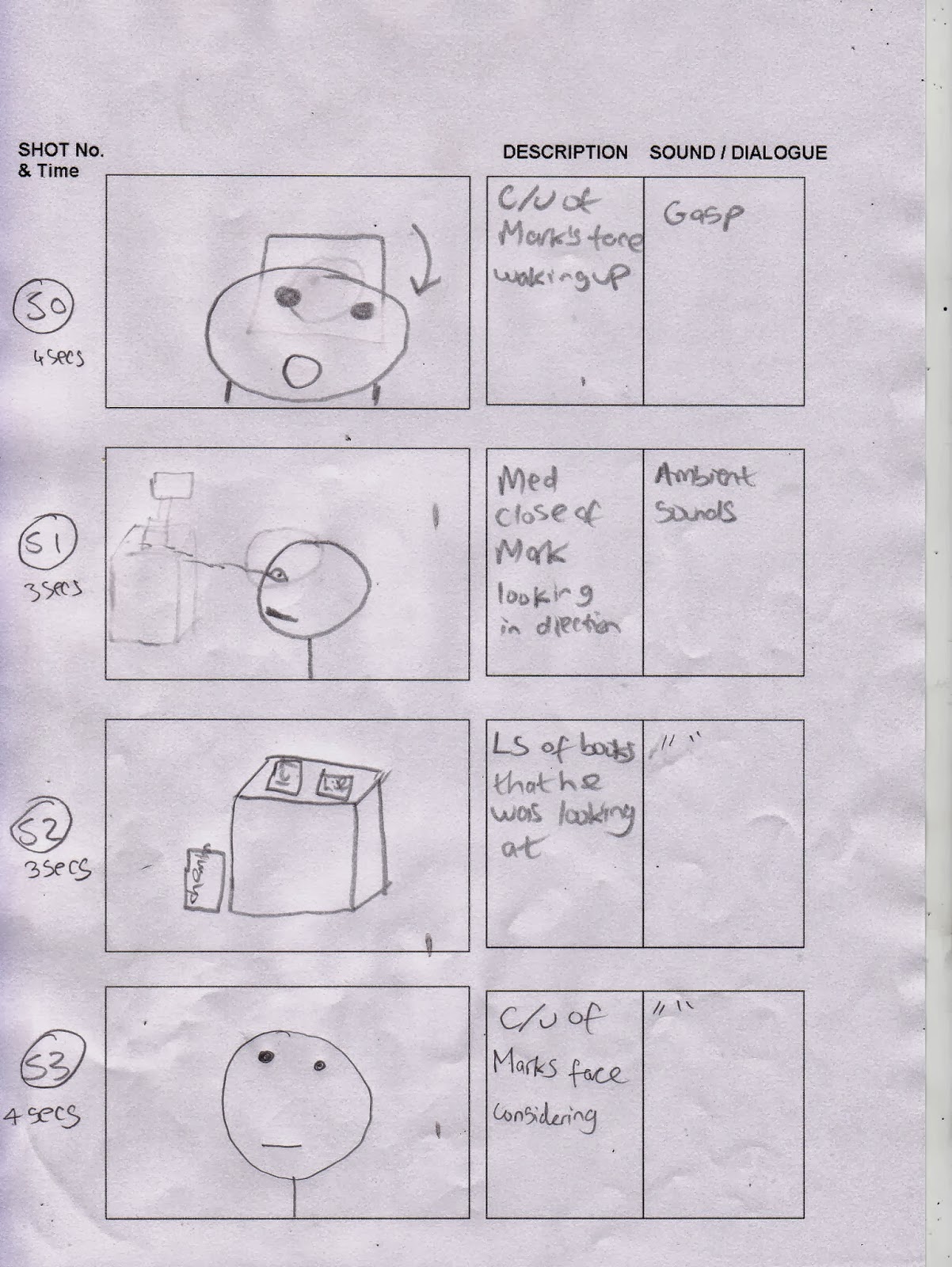
Storyboards

What is key for these scenes is the split-screens, however, we have considered that if these don't work that we would either use quick cross cuts between the different shots, to achieve the same effect. we got inspiration for this solution from "Malcolm in the middle" in which quick cross cuts are used to a comedic effect. something to consider for that is a possibility sound effect, like a swipe whenever something like this takes place.


If this fails we have decided to use shot reverse shots to accomplish this illusion, but without using an over the shoulder shot due to the impracticality of getting someone with similar head shape.
 In the following scenes we have implemented split-screens again in order to show the possible futures of Mark at the same time. The software on Imovie should be able to accomplish this for us and if not then there is always the possibility of using quick cross cuts to achieve this effect.


For the full effect we decided to put this scene at the end of the credits, taking influence from many Marvel Industries films, that have started to do this in recent history.
Subscribe to:
Comments (Atom)