Monday 30 September 2013

Summary: Short Film, Magazines and Posters


From going through and analysing the magazines, short films and short films poster it is clear to see that there are some areas that can be easily changed for when we are creating all of the above and some that have to be kept the same for them to be considered either a short film, film poster, or magazine review.

From analysing the areas needed, it is clear to see that some areas that have to be kept the same, in terms of the conventions for a short film are:
  • Narrative structure
  • Themes
  • Sound, editing mis ene scene
  • Titles
There are some areas that are particularly useful in my research. In terms of short films vs feature films from all the research it is clear to see what the difference is that a short film is potentially less than 15 minutes, 5 minutes in the case of our groups film. By analysing a variety of short films shown previously it is clear to see that in terms of the ending it needs to be unresolved with a plot twist usually there to change the narrative of the whole plot. The unresolved ending is a common feature in short films which allows the audience to be able to come up with how the persons life or lives will turn out after the film ends. 

The themes that have been analysed have also been wide range varying from a love story to a educational film. The potential themes for the film could be broad but to make a good impact some themes that could work are educating ones such as:
  • Bullying
  • Violence at home
  • Gun violence
  • Teenagers point of view of things compared to that of an adult
All of these are potential themes that can be used in the film in order to get our message across like that in "Gravity". 

In terms of film posters the key area needed is the billing code where by looking at a poster you would know that it is a film poster due to that; it is just one of the conventions that are needed otherwise the audience will not be able to recognise that it is a poster. However, featuring the cast in the film poster is not essential but our group might still decide to use it. This is because not all film posters feature these shown from analysing a variety of film posters.

The magazines to be able to work our group have to make sure that we get our target audience correct for if that is wrong the magazine review can potentially be read by the wrong people and therefore making people me more inclined to not read it.  


Film Magazines: Codes and Layout

For film magazines there are different variety of conventions on a magazine page layout. In terms of technical codes there are:
  • Section Titles
  • Headlines
  • Strap Lines
  • Introduction
  • Subheadings/breakout paragraphs
  • Columns
  • Pictures
  • Graphics and logos
  • Font and typography
  • Breakout boxes
  • Call to action
  • Byline
  • Issue Info
  • Image Caption
Despite having a large variety of technical codes available not every film magazine will have all of these codes, some having no Introduction or different graphics compared to some film magazines which will have these. For example, a magazine like Sight and Sound will feature less graphics due to the audience being more mature when compared to a magazine like Empire. Also in the case of an image caption where sometimes magazines aimed for less formal audiences would feature, next to the image a joke about the scene would feature sometimes. The image caption detail would depends on the intended audience of the magazine. The effects of having differing technical codes according to the magazine will have a differing effect depending on the audience that it is being aimed at.

This is a film magazine review in which Empire reviews Harry Potter and the Deathly Hallows Part 1. From the start the heading is made obvious (1) due to it's big font size taking up a good size of its respectable area. The various headings that have a variety of different colours available instantly makes it clear that the writer wants you to be able to have "fun" reading it and to keep you interested by the bright colours. The section title (2) featured at the top left of the page is the one of the conventions that is present in a large majority of film magazines. The section title is present here so that the readers when flipping through the magazine will be able to know which section they are in; especially if it is opened on a random page. Not only are they featured at the top they are also bigger in size compared to the actual font of the review being there to stand out so that the readers will be able to know which section they are actually on.
In the case of this magazine, the strap line (3) references that of the fact that the film is coming to a close after ten years. However, there is also another meaning where it means the end of one of the two main characters of the series. Therefore, to understand this you would have to have previous knowledge of the films.

Through all of the review there are no introductions and subheadings present due to not necessarily needing them for this review Also by not featuring them it makes the style of writing seem more like a review which is consistent instead of having headings, which can have the affect of making it seem like an entirely new point instead of having the review flowing. The breakout paragraph (4) is quite clever in how it works again expecting the audience to have watched the film to be able to understand the quote they are using. Due to this being a film series and one of the last films this is the reason why the review includes a lot of references. Additionally by using the breakout paragraphs the writer can take up more space on the A4 paper to try and fill the page.  The columns (5) and pictures (6) are all made to align each other up which as a whole makes it legible to read and understand. The picture is also taken up approximately one-third of the page which again is done to take up space but to also show a snap of the film. The size of the image affects the mode of address significantly coupled with the image caption that is present. By having an image that takes up a large majority of the page it makes it seem to be fairly casual possibly aiming to take up a large area. However, with frequent small images used in the magazine it gives the impression that the review is more formal and sophisticated. The actual text in the review differs greatly to that of the title. Whilst the headlines feature a Sans Serif font the main text features a serif font. This was done to make the main text look appealing which is a common feature a lot of film magazines do.

The use of breakout boxes (8) and the frequent use of graphics (7) gives the magazine a more informal look compared to others. However, again these are used to be able to take up the space of the page and to also give the readers extra information like a basic plot. A feature which varies depending on the magazine is the call to action, and byline both featured at the bottom of the page. However, the name of who wrote the review varies with some being at the top of the review making the reader seem more involved. In this case it is at the bottom of the review; a common feat for this paper. Finally, (10) the issue number which is present in some way or another gives the reader basic relevant information such as page number, date and sometimes the issue number.

It is through all of the technical codes which cause the page to differ from one magazine to another. The way that a magazine uses areas such as pictures, and columns and graphics all give the audience mode and who the magazine is aimed at. In this case the audience was for the informal ones and for ones that had some previous background knowledge to the Harry Potter Series.


The review of this film compared to that of the magazine Empire differs greatly in many ways. To start with whilst the first film review has two pictures present which takes up a good portion of the page in this magazine there is only one film present. However, as with the other magazine the pictures are still in line with the columns and vice versa. In terms of the details of the magazine compared to Empire from just viewing it the audiences differ greatly. Whilst Empire had information there, Sight and Sound has the credits of the film whilst giving pieces of information and the review about the film. Here, this makes the audience be slightly more mature as they might be the ones who are more willing to want to know the credits.

Another difference lies in the fact of the pictures and graphics. With this magazine there are little variety of colours present with most of the typography being in one colour. This differs to that of Empire which again featured a large array of colours which makes the magazine less formal.

Through the difference between the magazines it affects the page drastically which in this case makes the magazine more mature. However, despite this there are still common features present in all of them such as having a byline and call to action/issue info. Therefore it can be concluded that despite all of this,there are still technical codes that have to be present.

Written Codes
Written codes in a magazine article are the way the language is used to get its point across. The mode of address varies from different magazines where one can be very formal and the other being very informal; both of these change who the audience will be aimed at.

From the Vue review magazine for films the way that the audience is addressed is in a very informal manner. Using the word "slouch" and talking in a humorous, conversational way instantly shows who the mode of audience is. By looking at the "review" for "Did You Hear The Morgans" presents the audience mode as being:
  • Informal
  • Humorous
  • Simple
  • Chatty
Whilst it is still simple, the magazine still contains the relevant information that the audience would want to know. The fact that it is is simple links directly to the fact that people are already in the cinema watching the film and so, would want to know the basic information which might get them interested to go and watch the film later.

Additionally, the magazine assumes that people reading the review are interested in the two actors Hugh Grant and Sarah Jessica Parker due to on the information on the right giving more information that would not be relevant to audiences not interested about the actors profile. Therefore, from this magazine it is clear to say that this mode of address for the audience is for those interested in the two actors. In this way, it could be said that due to the mode of address being informal and simple the audiences change compared to the another magazine which is more formal which might have information relevant to some people. 

Compared to the review from vue Sight and Sound review in terms of written codes differs drastically. The mode of address for the audience is that of a:


  • Formal
  • Sophisticated
  • Articulate
  • Intellectual


The review there is a large variety of words which for a majority of audiences might not be able to understand such as "verisimilitude" this instantly sets apart the audiences and aims at who the magazine is aimed at; people who would  be able to understand what the language used means. Furthermore, the magazine also uses a lot of historical and contextual knowledge throuhgout such as the AIDS pandemic in the 1980's and the French culture shown in the films such as Alice et Martin (1998). This illustrates to the audience that to understand the review you would have to have detailed knowledge and understanding of French films and of the events that happened in the past. 

Therefore, the mode of address presents the fact that the audience would have to be quite intellectual to be able to understand what is written in the review and have some previous knowledge of events so that the review would be able to be understood. There is also an affect where the writer doesn't expect you to watch it giving you the whole plot of the film. 

Intended audience for film poster and magazine

For our film poster review the target audience will be aimed at teenagers going to try and educate them on certain information such as being in a gang. However, if the focus was to shift and was to go to be aimed for children depending on the film the review for both will differ greatly.
Whilst the film might be for the older audience or the younger audience the magazine review might differ. If a film review such as Sight and Sound was revewing "The Lion King" the review will be of a mature way despite it being a children's film. On the other hand, the film poster will be aimed for everyone so that the parents will be persuaded to take their children to go and see the film.

Sunday 29 September 2013

Layouts of magazine film reviews.

Some of the more generally subscribed film review magazines are:

  • Total Film
  • Empire
  • Sight and Sound (among the more established and educated film buffs)
With such cinemas as Vue, Odeon and Cineworld providing their own magazines featuring film reviews. These different styles of magazine will have differently constructed layouts, as well as style, content and mode of address for their reader.

Total Film and Empire are direct competitors with each other, both producing similar style reviews with a more casual, relaxed and often comical and informal mode of address with their reader. this is how they would attract their audience which is the general movie goer, with a more expanded review than what you would find in a news papers, featuring graphics to help explain these, often coming in the form of graphs or diagrams that aren't always used in a serious manner. one example of this by Total Film is the "predicted interest curve" which suggests your mood based on the film at specific stages within the film.

Moreover, these types of magazine film review would also feature photographs or stills from the film which would fall in line with the columns of text, and in some cases take up most of the page so as to downsize the amount of writing necessary for the article itself.

There are 14 different components that make up a magazine review article, in most cases, of which are:

  • Section Titles
  • Headlines
  • Strap Lines
  • Introduction
  • Subheadings/breakout paragraphs
  • Columns
  • Pictures
  • Graphics and logos
  • Font and typography
  • Breakout boxes
  • Call to action
  • Byline
  • Issue Info
  • Image Caption


  • As with film posters, not all of these will be used. It is the way they are used, or omitted that will indicate the audience content and style of the piece itself.

    This review contains 11 of the components, including Section title, Headline, strap line, photographs, graphics, font and typography change, break out boxes, byline, introduction and Issue info and of course, columns.

    all of these components are vital for dragging in the reader and encapsulating them in the review article, oft times, making or breaking the film itself, and as to whether people want to go see it.

    The mode of address that is given by this review article, is one of informality, it displays enough written codes about the synopsis of the movie and the films merits and its faults.

    Moreover, the strap line used is "sex lies and toupee tape", this is reminiscent of the song "sex and drugs and rock and roll", which describes the life of a rock star but has altered it for Liberace, which assumes the reader is old enough to know where the reference comes from.

    Unlike "Empire", total film displays all 14 of the general components for a magazine review article: section title, headline, strap line, photographs, breakout boxes, by-line, issue info, graphics, introduction, logos, breakout paragraphs, call to action and columns.

    This issue contains a more compact article that focuses more on the images than the review itself. this is designed to draw in the not so active viewer that wants to get to the point rather than read a dissertation on why you should watch this film.

    The mode of address is completely informal, more so than Empire, the pictures take up most of the review and uses of comedic captions are used to entertain as well as inform.

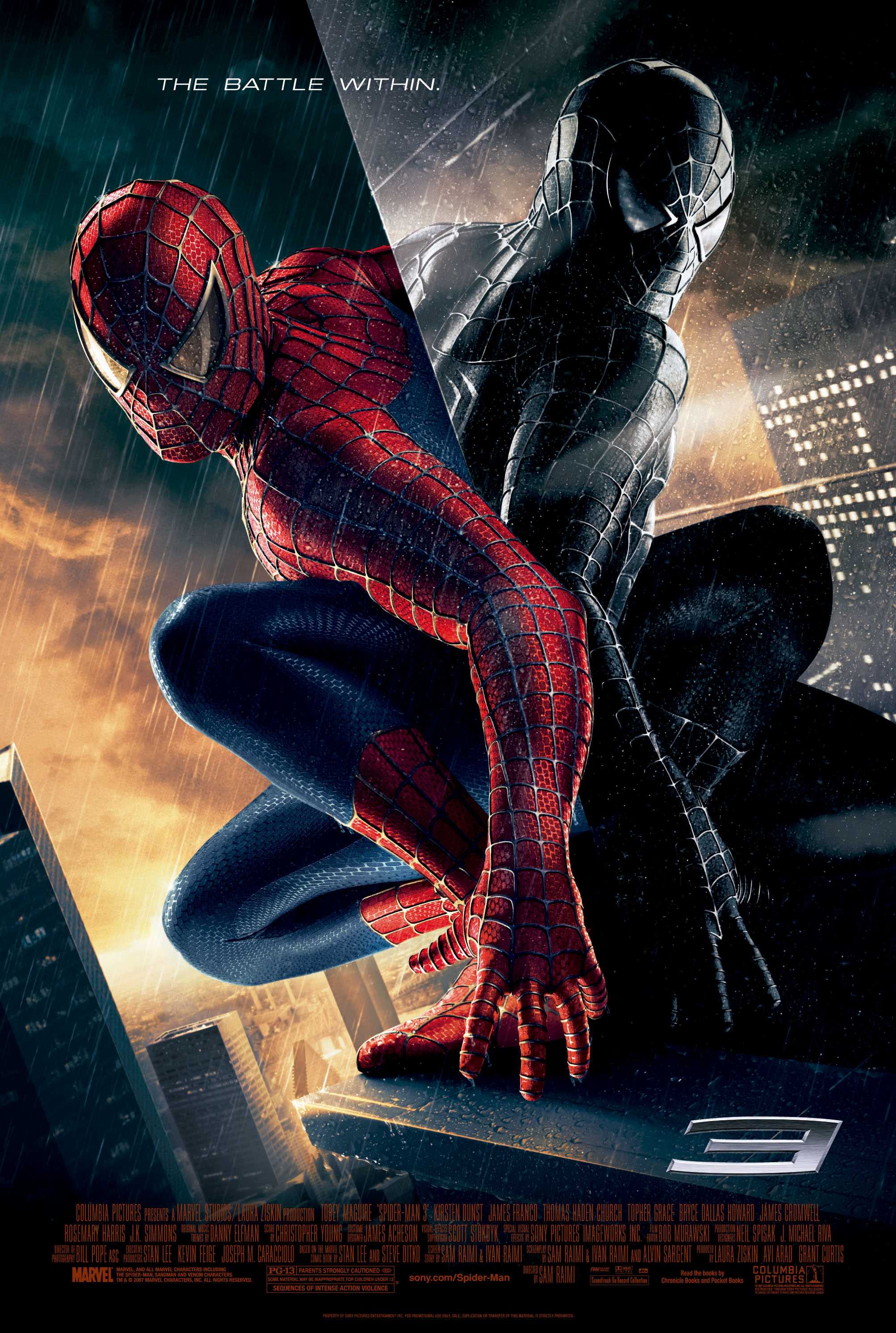
    Some semiotics that can be seen on this page is the way that character is moving on the image. Being in mid movement it highlights subliminally that there is exciting action in the film, as it has been freeze framed on that exact moment in the film, as if the character has realised something important.

    Depending on the Genre of short film we will aim to create, more likely a less serious one, I believe we can take inspiration from this article and its informal but definitely informative way to attract and inform the audience.

    These examples of deconstructed magazine review articles.

    This is an example of the REVUE article by VUE cinema. some of the components that are absent from this review are graphics and byline because of the informal nature of the article. the lack of byline suggests to the reader that anyone could have written the article, making it a glorified movie poster. the pictures that dominate the page also suggest that the article isn't just about the writing as much as its about promoting the film.

     this article takes a different approach however. unlike the VUE article, this review contains some pictures but is dominated by the extensive analytical written codes of the review itself. this gets the message across to the reader that this is for the more educated mind and doesn't take a biased stand point due to the amount different paragraphs that contain different written codes such as context, references and analysis... etc.

    This article from total film displays all of the conventions of a generic movie review article. it takes themes from both the Sight and Sound article and the REVUE article. the article is very informal, using comedic straplines and image captions to draw in a layman audience.

    however, unlike the review article it does give an analysis of the film, rather than just pick out all the good parts of the film to bring in its audience, because unlike the article from VUE this article isn't catering for an audience that could damage their profits by being put of from watching the film altogether by the article.

    unlike the sight and sound article, this is intended to inform rather than educate, which leaves it open to any audience and will be respected more than the VUE article would be.


    Tuesday 24 September 2013

    What is the purpose of magazine film reviews?

    A magazine film review is, in most cases, an analysis or summary of a film from a neutral stand point. Typically they are seen as neutral in most cases, showcasing the opinions of professional journalists, but in some cases, can warp the truth or only promote the film, rather than give a balanced viewpoint of a films pros and cons.

    Examples of independent magazine reviews are:

    • Total Film
    • Empire
    • Sight and Sound
    These are the main three, with Total Film and Empire aimed at a target audience of "casual film buffs", whereas Sight and Sound provides a more educational and analytical approach to reviewing films. These are dedicated to film, whereas such magazines as Slant Magazines and even reviews in generic newspapers branch out into other media.

    However, examples of a more biased review magazine would be those produced by the cinemas themselves, such as Vue, Odeon and Cineworld, all of which would never dream of deterring an audience from going to see the films they're showing and possibly lose a market to make money from.

     What is the purpose?

    Unlike a movie poster that is produced by the production company itself, Magazine movie reviews are generally independent from the film itself. A movie poster is designed to alert a target audience that "this film is coming out soon! come and see it", whereas a magazine review is a tool for the audience to see a synopsis of the movie, and possibly a critique to see if this is a film they would like, or is good enough to go and see.

    At its bare minimum, a movie poster acts more like an advertisement than a judgment of the film, and would never show the film in a bad light, with its semiotic codes, whereas a magazine review uses written code to alert and inform the public about the film they could potentially see, with a balanced argument, so that a review isn't all good and isn't all bad.

    Magazine film reviews are vital to a movie campaign and contains a risk factor that could make or break the movie, making it popular or promoting the judgment that its not such a good film.

     In the case of these two, the movie poster provides an epic image into what the "Serenity" will be about featuring weapons and a space age theme, where as the image to the left provides an analysis of the film, which highlights some of the least exciting aspects of the film, but will showcase some of the good aspects as well.


    What is mode of Address?

    Mode of address is the way that the magazine review article interacts with the reader, and how it speaks to them. This comes in two main ways, Formally and informally, but breaks down into many subcategories, such as humorous, educational, serious, etc...

    Mode of address is always aimed at a specific audience, and in such magazine review articles as Total Film and Empire, is quite often a layman audience, which allows them to be informal and humorous in their approach to the reader which claws the reader in. However, such articles from Sight and Sound review magazine are often more an in-depth analysis of the film and the way its structure and the political social impacts that the film makes, which makes them informal and can be used for educational purposes due to their insight.  

    For example, if an article will only depict the positives or list the negatives in a good light, then the mode of address is telling the reader that they need to see the film, not because its a good film to see, but because we need to make money from it. Magazines that are famous for this are Cinema produced magazines, as sales of tickets are all that they are interested in, and is there attempt to attract audiences.

    Monday 23 September 2013

    Film Magazines and their purpose


    The purpose of film review magazines differ greatly to that of a film poster. Some of the main features of which differs the two apart is that for a film poster the audience are gathering basic information from the poster. The poster will usually have a positive attitude to the film in the hopes of trying to get audiences to go and watch the film. In the case of the film "Ted" there are constantly reviews at the top with ratings four and up from companies such as Empire or The Guardian. All this make the film poster slightly biased with films constantly praising the film. Whereas in reality it might not be that good or a piece of the review might be taken and put on the poster and the word which is used helps to make the film better. Audiences are more likely going to be intrigued to watch the film because of the reviews on the poster where they might think if companies such as Empire are rating it good it must be good. Therefore, being more inclined to watch it.


    Film review magazines on the other hand are not produced by the production companies but are usually produced be third parties. The majority of the information that is written normally contains an impartial subjective opinion which for this reason makes the review much more balanced when to film posters but not all wholly accurate. The audience interaction compared to film poster also differs. Film review articles for the audience utilise third party impartial opinion in order to inform the audience about the film. Film reviews are significantly important to a films marketing campaign due to some people judging on whether to see the film or not which has an important part in the businesses profits.


    In the UK there are three main film magazines those being:
    • Empire
    • Sight and Sound
    • TotalFilm
    Whilst all of these do the same similar job as in some way or another they will all review a film whether it be out currently or a film made in the past. The difference being between them is that their layout, content and who their target audience is will be different.

    The Empire for example will differ greatly to that of Sight and Sound. The Empire, has an informal approach making it seem almost like a conversation that one would have with a friend. It also is quite simple to understand using only some words which some people might not be able to understand such as ominous. In the case of image caption for the film "Dealine" it is quite humorous which in a way mocks what the people on the images are doing. In this way, it clearly again illustrates the mode of the audience as informal and not as intellectual as other film reviews. Therefore making the content suited more for the younger audiences and having light-hearted content that is amusing yet interesting to read.

    The layout of the Empire is also constantly the same throughout each of the reviews. From the two film reviews that are shown in the image. It presents the images dominating a large majority of the A4 paper with breakout boxes taking over the rest of the page besides from the actual review. This was done so that the writer was able to take up all of the page as leaving spaces filled with white is not possible due to the whole page having to be filled up.


    Unlike Empire, the magazine Sight and Sound takes a very different approach in terms of its mode of address, audience and the whole design of the magazine. Sight and Sound takes a more formal approach in terms of its language. It has a more sophisticated and articulate approach when comparing to Empire which was more informal.

    The biggest difference from the two however is in fact the page layout of the magazine. Whilst Empire's review was on one page the image was still dominating a large majority of the page. For Sight and Sound that is not so there are more images present but there are more columns which give more detail and depth to the film and review compared to Empire which was just summing up the film. This again sets the audience as one who has seen the film already due to making certain references to the film. Also, unlike Empire's image caption which was mocking what the cast were doing the image caption here is actually sticking to what the cast are actually doing making a joke on gravity at the end. Therefore, the audience are made to be a lot more mature compared to other film magazines.

    The final major film review magazine comes from TotalFilm. It's mode of address is similar to that of Empire though being slightly more mature than it, not really giving any mocking jokes like that of Empire. The layout of the film though containing the same even structure as the others has features a large variety of images and graphic compared to the other magazines. The graphical image of the star rating compared to Sight and Sound gives a less formal sophisticated audience. The image again here dominates a large majority of the page which seems to be a common feature in magazines which are not equal to Sight and Sound. This was deliberately done again to take up more space but also because they have not got much to talk about unlike the other magazine.

    Wednesday 18 September 2013

    Film Posters: Written Codes

    Written codes feature in every single film poster with a large majority of films featuring taglines. They are usually catchy, enticing, short phrases used to advertise and sell a movie. However, they can also quickly sum up the plot, tone, or themes of what the film is actually about.

    The film poster Source Code makes effective use of its taglines. At the top to appeal to some audiences it features the name of the director who created a previous film called "Moon". This might entice audiences who previously watched a film of is and might want to watch this one. The Tagline" Change The Past, Save The Future". Is an effective use of the rule of three. From this the plot and genre of the film is told to us already. Due to the tagline the audience can assume that an event will happen that will cause the main character pictured in the poster to go back to the past to fix it. It also has the genre of being a sci-fi film with the main character actually being able to go to the past.

    This for the audience automatically tells them the type of film that it is and so would have the effect of grabbing the relevant audiences that are needed.

    The title is also in big bright red letters compared to the rest of the poster which makes it stand out compared to the rest of the titles. The use of the bright red colour also has an effect of possibly foreshadowing the events that are going to happen in the film. The film possibly has danger, or death somewhere in it denoted through the use of the colours that are there. The title also hints that the as it is a "Code" it is going to be quite hard to solve which could possibly link to a detective genre as well which might bring in a new range of audiences.

    The film poster Spiderman 3 despite not saying much compared to the film poster "Source Code" is still effective at what it does. At the top unlike that of Source Code is the tagline "The Battle Within". The rule of three is once again present which gives it a short catchy phrase which the audience are more likely to remember. This tagline like before tells the audience what the idea of the plot might be. In this case the plot could have elements where Spiderman has to fight the darkness within him for whatever reason due to the word "within" which emphasises that the battle is part of him. The image of Spiderman, the protagonist of this film also reinforces the fact that he has to battle a part of him. Through the use of the dark image of the protagonist on the window it shows a direct contrast to the bright colourful "superhero" costume.

    The title in the film is also not very clear compared to that of Source Code however this was done as it is a series and a large majority of people are expected to know it. The number 3 is there to present to the audience that this is the third Spiderman film which as an obvious sequel to the previous not continuation. Through everything shown on the poster and the fact that it is raining and grey tells the audience that is a dark film compared to the previous ones. This as a whole setts the scene and has the effect of telling the audience what to prepare for in terms of the tone for the film.


    The film poster Grown Ups compared to the last two film posters takes a different tone in terms of its tagline and film title. The image of the five main protagonists of the film are featured to be having fun and laughing when they are going down on the water slide. Therefore it straight away sets the mood for the movie as being quite a comical film which might appeal some people. The tagline of the film is quite ironic more so the beginning. "Boys will be boys" is usually something that will be said to young male children when they do something that is very male. However, it is quite ironic that this phrase applies to the case of five grown up men. This again tells the audience that is going to be lighthearted. This is reinforced by the bright dominant colour of blue. This as a whole sets the mood for the audience who will be able to know that it is going to be a positive film that they will be able to laugh at.

    The title "Grown Ups" also works with the tagline. It is perhaps quite ironic as it works against that of the tagline. The fact that they are adults but the title states that some of them take longer to grow up than other people gives a direct comparison to the two.

    Tuesday 17 September 2013

    Film Posters: technical codes and their semiotics

    Within a film poster there are conventions that are available when viewing the film poster. The first of these are technical codes. The technical code is used to construct a text. The technical code indicates to the audience that they are viewing a film poster instead of a magazine review. For example, it would have the inclusion of a:
    • Film Title
    • Tag Line
    • Billing Block
    • Main actors
    The Poster for "The Dark Knight Rises" has all of the necessary codes which make it a technical code. The film Title is The Dark Knight Rises which is a continuation of the previous film The Dark Knight. Behind that features an image of a bat which straight away shows the clear link between the title being a film about batman and the bat which was his fear. The tagline being "A Fire Will Rise" is a sort of a play on the film's titles. In a way it reveals that due to a fire, something destructive is going to happen in the film. The tagline is short and simple to remember therefore more likely for people to pass it to find out more information about the film. The Main actors appear on the top of the poster which tell the audience which of the actors will appear. In this way it can appeal to a large majority of people if they like certain actors. 


    The Billing Block for The Dark Knight Rises as with all other film posters appears at the bottom of the poster. The billing block is the list of names that usually have had some part in the film posters such as Christopher Nolan who was the director of the film. It also has detailed contracts between the artists and the producer. The billing block is usually in different fonts compared to that of the rest of the poster so that the characters meet the contractual constraints while still allowing enough space horizontally to include all the required necessary text. 


    The list of technical codes will appear in a different variety of places depending on the poster of the film. Harry Potter and The Order of The Phoenix for example the tagline appears at the top with the title of the film appearing at the bottom. However, the major difference between the two posters is that unlike The Dark Knight Rises poster there are no actors names anywhere except in the billing block. This for the case of the film was most likely done due to after five films it would be assumed that people would know who the cast are. Furthermore, the fact that it is a teaser poster not all the information that would be present in the final poster(s) will appear here.  

    Semiotics

    Semiotics for film posters are the study of signs and symbols within a poster and the messages that we read from them. Film posters have a large variety of semiotics; the main purpose is so that the audience can quickly process a lot of information from just the visual imagery contained in them. This is because of a lot of the audience when looking at film posters will be seeing them on a bus or on a train platform. 
    Therefore, several things would need to be considered in a film poster in terms of semiotics. Some of these are:

    • Images
    • Colours
    • Titles and fonts
    • Layouts
    All of these are essential in order to get the audience to quickly process the list of information that the audience need to know about the film in a short amount of time. 

    In the case of the film poster Juno there is a large amount of symbolism in the poster which instantly make it stand out due to the visual imagery and the colours that are present throughout the poster. The colours of the poster being bright orange and white are already a combination that is eye-catching therefore making audiences more likely to read that poster. The fact that it has a male cast on the left dressed in school sports uniform denoted by the logo, states that it is something related to a teen comedy film. The film title "Juno" also seems like it is drawn on by someone would do if they were bored unlike The Dark Knight Rises which was done graphically. 
    The image of the female pregnant instantly states that the plot is going to do with something about her pregnancy. 

    The tagline below the film title is quite ironic in what it does. The tagline "about growing up and the bumps along the way" is a play on what it actually means. The bumps along the way would mean the bad situations that a teenager usually goes through when growing up. However, in this way it is about her getting pregnant. Altogether the bright colours the way that the two actors are preforming looking in an awkward way couple with the mise en scene which presents youth and the fonts everywhere represent the comedy genre                


    The film poster for Harry Potter and The Deathly Hallows (HP7 in the poster), is graphically different when compared to Juno mostly due to being a completely different genre. In the case of colours compared to Juno which were bright and colourful, this film poster the colours are dark and gritty already saying to the potential audiences that the film is going to be quite dark in its tone. As it is a series people would be assumed to know the characters of it. The image of the main antagonist already is eye catching as he is shown using magic with sheer destruction surrounding him. This for the audience is already eye catching which due to the colours the audience might be instantly intrigued by what is happening. The appearance of the antagonist is also menacing which again people would want to know why and what has happened. The titles of the film title uses the traditional "Traditional Harry Potter Font" which people would be able to recognise. What is most effective about this poster is the tagline "It all ends" for fans of the series they would know by the tagline that this is the last film, thereby wanting to go and see the final film. 

    Technical, Written and Semiotic codes

    What are technical codes?

    Different technical codes make up movie posters, often some will omit these in order to achieve different aims such as creating a teaser poster, or even to omit some of the key features in the story that would be ruined on the poster.The Technical codes of a movie poster are the factual aspects to it, that stand out to the audience and inform them about the film in terms of: 
    • Lead actor/actress                  
    • Tagline                                   
    • Billing block                           
    • Title                                       


    The name of the lead actor
    is represented here.

     
     Another technical code is the
    Tagline "Its nothing personal"


    The title of the movie as usual is 
    just above the billing block.


    At the bottom, like the majority 
    of posters, the Billing block can
    be see.


    The billing block of a movie sums up all of the directors, producers, actors, writers as well as the production companies that will have endorsed and funded the making of the film. similar to the credits at the end of a film, the billing block gives credits to the most important people from the film, and won't for example include the make-up artists or the lighting executives would not feature on the billing block, considering its just a small portion of the poster.

    What are written codes?

    these are the words that are used in the tag lines themselves to make a short summary to the films. Tag-lines are the catchy, enticing short phrases used to attract potential audiences in, and sell the movie to the people. Sometimes it can sum up the narrative in a short sentence or convey the genre or themes of the film and often provides subtle narrative or genre information, which wouldn't be communicated by the title and images alone. e.g. "part-man. part-machine. all cop. the future of law enforcement" from Robocop (1987) sums up the premise of the film, a cyborg police officer, that becomes the new face of law enforcement in Detroit. the use of the short sentences to create the phrase is powerful and tells the audience all they need to know about the film, to create interest.
    Another example is this tagline to Alien (1979). This is one simple phrase, but split into two parts, reveals the theme of the film and the genre. "Space" automatically links to the Sci-Fi genre, as well as the use of the word "scream", showing the film could be a horror/thriller as well.

    What are Semiotics?

    Semiotics is the study of signs and symbols, which is heavily used in movie poster from the past up until the present. This is often the connotations of certain images colours and even font styles that are used in movie posters. like written codes these also show the themes and genre of the movie they are advertising, but in a more implicit way.


    For example, this movie poster for Star Trek, advertises that it is a movie of the Sci-Fi genre, but shows it to people that previously may not have seen the series of films or TV. this is shown through the use of colour and font style, the use of the dark blues and silvers in the poster are reminiscent of the futuristic and sci-fi genre, and audiences that have come into contact with movies like this before will recognise it and understand the genre from the colours. 

    the same goes for the font style in the title, a futuristic font for a film set in the future makes sense and is very relatable for a target audience for sci-fi films.

    The most obvious image also that endorses these points is the image of the "spaceship" in the background layer, but goes to show how semiotics in movie posters can point out stuff without the most obvious images to confirm these ideas.

    Monday 16 September 2013

    Film Posters

    The exact purpose of a film poster depends on the view of whether you are the business or a person viewing it. For the film producers it would be made to advertise the film so that the public will be able to know about it. The pubic therefore, rely on posters to get knowledge that the film is going to be released and know little information about it. Film posters however, will not always feature all of the technical codes. By having some technical codes instead of all of them it will have a different affect. For example, if the name of the main actors was not there and had no tagline, or name of main actor(s) it could be said that it is a teaser poster, only being there to tell the audience that the film is coming. Film posters usually have a number of conventions that make them a film poster:

    • Name of the main actor(s)
    • Background Images
    • Billing Block
    • Picture of the star(s) of the film
    • Film Title 
    • Tagline
    Extra Large Movie Poster Image for ScreamIt could be said that the billing block is an important part of the iconography of a film poster as it is a key symbol of the media type. Pictures of the stars of the film are not always present in the film such as in the case of horror or thriller films. This is usually done in that particular way not to reveal any of the characters initially and to try and get the audience to watch the film. Film posters usually appear in several places around a particular town. Posters usually appear on the train platforms, on the bus, or passing by it on the street on a billboard; they are viewed quickly and often on the move. Therefore, it is essential that the creators of the film posters create it as eye catching as possible to be able to get the attention of potential audiences in the hope of trying to grab them in to watch the film. 


    Over the years film posters have changed dramatically with the ones in the earlier last century being vastly different to the ones of today. Film posters in the early last century were used outside of just the cinema. The posters unlike now were not distributed as widely as they are nowadays. Film posters such as the Sound Of Music also have a major difference in terms of how they are actually made. Posters before as shown on the left were drawn onto and copied to be hung up to view. They would usually have to be given back to the distributer after a certain amount of time has passed. The film posters usually then would have something to do with the film or usually have a key point that takes place in the film. 


    Film posters nowadays differ drastically from their earlier counterparts. Unlike earlier posters which would be made from drawings posters in the modern age are made using the actual actor on the poster. For example, for the poster on the left Will Smith is featured as a sort of image which was edited there onto the background of the poster. This is the major difference where digital technology has evolved. Digital technology such as Photoshop allows image manipulation and the layering of images which has changed film posters dramatically over the years. The tagline is perhaps the most memorable feature of posters which people are most likely to remember. They are usually short and to the point as there is not enough time to see a lot of detail. 


    There are a different variety of movie posters that exist nowadays all aimed to grab the attention of the audiences by standing out through the use of colour primarily. Normal film  posters are seen from some of the film posters above. However, another type of film posters that are present are teaser posters. Usually there for a film series that is already well known and is likely to continue past one film. 


    The teaser poster for Skyfall for example is just one example of the many teaser posters that are available. The purpose of teaser posters is to let the audience know that the film that they want is being produced and that it will be coming to cinemas eventually usually within a year unless postponed. This is why teaser posters are produed and usually little to no information besides a possible year or month of the release date. For our groups film poster a teaser would not need to be needed due to it not being a series and only being a short film. 


    Another type of poster that is used depending on the type of film is character posters. These posters are extremely effective in the case of trying to reach a broader range of audiences. By presenting female posters in the film Thor. It might help draw in some of the female audience who might realise that the film is not dominated by an all male cast. Character posters are usually distinct for that one single character having the poster to themselves, a release date to the film and then something which relates to that character. As you can see on the left Loki is "The God of Mischief" which is what his character is. 

    What are movie posters?

    Movie posters are advertisements used by productions companies to promote the movies that are coming out, usually featuring:
    • A title
    • A tagline
    • The Billing block
    • Name of the actor in the lead role
    • A picture of the actor as the character (often with a supporting actor)
    • A picture of something in the background which usually resembles something in the plot or narrative
    • The BBFC certificate of the film (more often than not on the DVD release cover instead)
    Movie posters can be found in a range of places, from billboards to magazines, and come in two main forms. The first is the movie release poster which contains all of the information that is needed for a movie goer to get attracted to a movie, with all they need to know from release date to director and so forth. Not all movie posters will have all of these technical codes. using or omitting them will be done for a reason, either to tease information or withhold some plot devices from the film.


    For example, the movie poster for the Dark Knight on the left
    features merely a famous quote from the from the film, that will be recognised when they go to see it, "Why so serious?", as well as the title and the symbol that was made famous from the previous film of the "Bat Symbol". this iconic symbol on its own would be enough for audiences to recognise which franchise this belongs to along side the title of the film "The Dark Knight". this is an example of  "Teaser poster" which allows potential audiences to know that a film is coming out, leaving them in anticipation.


    However this movie poster, which would have been released closer to the to the date of release, featuring the main cast which may not have been fully cast yet, as well as a possible still from the movie. also, both posters feature release dates that are very different. the poster to the right says the year of release date as opposed to a month or a day. the one on the left gives a specific release date, shown that this poster was released in the same year as the film whereas the one on the right wasn't.


    However, over the years movie posters have evolved from drawings to photoshopped pictures, which attempt the movies to look more epic, however both use the technique of layering, in order to create the posters. for example, in this poster for Prometheus (2012), there is a picture in the foreground of a possible explorer shinning a light into the distance, where as the background features a large statue, which would eventually featured in the narrative.

    However, posters from earlier movies would have featured drawings as opposed to photographs to compose them.
    this 2001: A Space Odyssey poster is not as up-to-date as the current movie posters, but still follows the same rule of layering in its composition, having pictures upon pictures in order to show a lot more information and sometimes, show a hidden meaning.

    Over the years movie posters have changed the way in which they are constructed but the premise of layering pictures has been kept by most production companies. Movie posters have over the years developed to have two purposes, one being their intended purpose of advertisement, and the other being collectors items. Earlier posters were often hand drawn, but in modern times, photographs have been used with photoshop to layer and create a more enticing image for an audience to be attracted by.

    Audiences for short films

    Short films have different audiences and different audience expectations to that of a feature length film. due to their length, not many productions companies decide to invest in the short film medium because the question is always asked, "how are we going to make money from this?"

    this is a key question with a simple answer. lack of supply and distribution. not many people would pay the same amount of money for an hour and a half movie as they would for a 5 minute long one from HMV.

    Also, not very often will they be shown in the cinema or on TV and so results in the audiences more or less having to search for the short films themselves on Short film promotion websites such as Channel 4, BBC and failing that, can often be found on YouTube. Not being heavily funded doesn't just effect the film its self, but also the advertisements and promotional campaign. The lack of distribution of short films is the bane of their existence as not many can find these in cinemas and such so they must be found on the internet, but must be sought out in most cases rather than being advertised themselves.

    although because of this there is no classification for short films and so all audiences are eligible to watch it. However, this doesn't mean to say that all audiences will want to watch it, it all depends on the target audience in themes and genre of the short film. for example, Hitchcock (2012), is rated at 12a. this does not mean to say that 12 year olds will be breaking their necks to go and see it, but simply means that the themes in the film are only suitable for that specific audience.

    Another key feature about the audiences for short films is that there are different audience expectations when it comes to short films. Audiences for short films generally have a restricted audiences, where as feature films have are renowned for having varied audiences, where as until recent times audiences of short films have struggled to find audiences. Potential audiences don't expect a lot of depth when sitting down to watch a short film, they expect it to get straight to the point and have, most of the time, an abrupt or unresolved ending. some prefer short films to end like this and some don't, leaving the story unresolved can make the audience yearn for a sequel, like with the harry potter franchise and the main antagonist surviving the 8 films, but some also like abrupt endings because they are more powerful and convey a more powerful message.

    For example, the short film "Gravity", a film about a kid that refuses to give up a recently found gun, shoots it, and the person they think they have hit, gets up unscathed, and so the audience believe everything is okay, until the camera almost tracts the movement the bullet would take when shot in the air, in 2 180° tilts, to reveal the bullet dropped out of the sky to kill a child, showing almost the power of the stupidity in the teens actions, and the implications they can cause.


    Short Films and their Audiences


    Short films compared to feature films have a major difference; the obvious being run time. The difference between feature films and short films however are the different audiences and their expectations for the films. The information present in short films if made to educate the audiences such as in "Cherries" which was made to educate the audience about young people's possible reactions to the call to war. 


    Feature length films tend to have more mainstream audiences which respond better to mainstream themes. Short films o the other hand, tend to challenge audiences s bit more and audiences expect this as they have different exceptions of short films compared to feature films.The main people who would usually watch the short films are those who are willing to go to festivals such as the Sundance Festival which takes place annually in the United States where short films are usually shown there. Most feature films such as Harry Potter do not do this where after the eighth film comes to the conclusion that everyone is fine after the main antagonist is dead. Therefore, the audience are the most important to consider when creating a short film. A justified conclusion is what most audiences want when watching a feature film so it seems like they have had their moneys worth. 


    Short films compared to feature films are not distributed as much or if any to the general public as a feature film this is why the audience is few when compared to feature films. Before the release of The Avengers a large variety of film posters, trailers on TV and on internet sites such as Facebook and YouTube all presented to the general public with the necessary information about the film. For a short film as they are usually a low budget film with a relatively unknown cast they are generally not distributed as widely. Usually companies such as the BBC and the British Council Film if in the UK distribute the films to the public that are interested in it. 

    Despite all this, due to the increase in technology over the years there are now a large variety of ways that people are able to access and watch short films. Technological convergence for example has been able to produce smartphones such as the Iphone and android phones where people can easily be able to access and watch short films on there. However, there are three main ways in which new media has expanded the audience for short films. The internet for example, has more than 2 billion people using it with 70% of the users using it daily. This is just one way that the audience are able to know about short films. However, compared to feature films the audiences are few in the cases such as "Get off my land". On the contrary, films such as "Gravity"might be more popular in schools aiming to educate young people or on TV channels such as Channel . Another way technology has helped is through YouTube. Audiences are able to watch short films due to new media. The fact that people can research films in the comfort of their own house without moving or actually going to a festival to watch it, for some is a benefit. This is one of the most major ways that people get to know short films with others being distributed by the BBC as stated before.

    Through all of these benefits to the increase in technology over the years there has not been a significant number of changes to the people who can access them. Whilst it is true that the BBC and YouTube have made short films more accessible, due to the limited advertisements of them they are still not being watched that much. Secondly, to be able to find them you would have to have either previous knowledge of them or be able to search for them which people usually do not want to do. Therefore, whilst there might have been a change in the type of audience who can access them it isn't a dramatic change.

    Although the British Board of Film Classification sets the guidelines for films, it does not mean that they have to be watched by everyone in that age group. For example, The Avengers though classified as being a 12 does not mean that people who are in their teens will necessarily like the film. The same could be said about the film Diana. It is rated a PG but does not mean that children would want to go and see it. Therefore the BBFC are there to guide but not restrict what age group would see it unless it is above their age to see it in cinema.

    In terms of short films one key fact is that due to the major distribution models of short film (i.e. the internet and festivals they will often not have a age certificate because of this. 

    Therefore, depending on the film that our group decides to do the age rating has an affect on the audience. If it is rated too low then one potential audience might diminish and the same if it is too high. Overall, the target audience is essential and if not done correctly could lose the audiences that our group would potentially need. Through all this it can be said that our audience could be rated a PG. The age rating has been chosen due to the fact that we might be able to talk about controversial issues whilst still being able appeal to everyone. However, if the audience was for an audience to educate about Gun Crime it the age rating could still be the same, but it would be targeted at people in the teenager years.